# Media Queries
# Learning Objectives
After completing this lesson, you will be able to:
- Make a webpage responsive for different size devices
- Conditionally apply styles with CSS
@media - Understand the importance of mobile first development
- Use a media query to create a breakpoint.
# Lesson
# Responsive Design
Responsive Design is an approach to building websites that accounts for the differences in screen sizes across the range of devices and platforms. With this in mind, a website should be viewable on different devices (laptop, phone, etc) by adjusting the content for screen size and orientation. It helps web developers and designers create websites that will render correctly no matter what device their visitors are using.
# Mobile First Design
When you are creating a website using a Responsive Design, it is recommended to use a process called Mobile First. Mobile First development means building a website as a mobile site first and then adding layout rules for larger and larger screens. With the limited size of the mobile screen, it allows developers and designers to focus on delivering the most important content to the largest number of users.
# Chrome Developer Tools
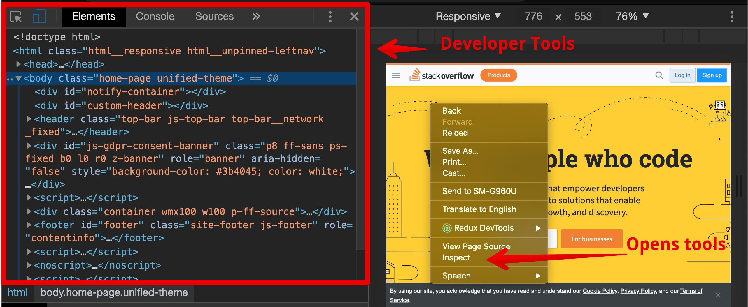
The Chrome Developer tools are the best available and are built into every version of the Google Chrome browser. Moving forward in your career you will be using the Chrome Developer tools (or more commonly the "DevTools") to design, debug and test your code. To access the DevTools, right click on a web page and select 'Inspect' from the menu. Alternatively, you can press F12 on your keyboard.
'device toolbar' allows a developer to view a webpage as it would appear on other devices.
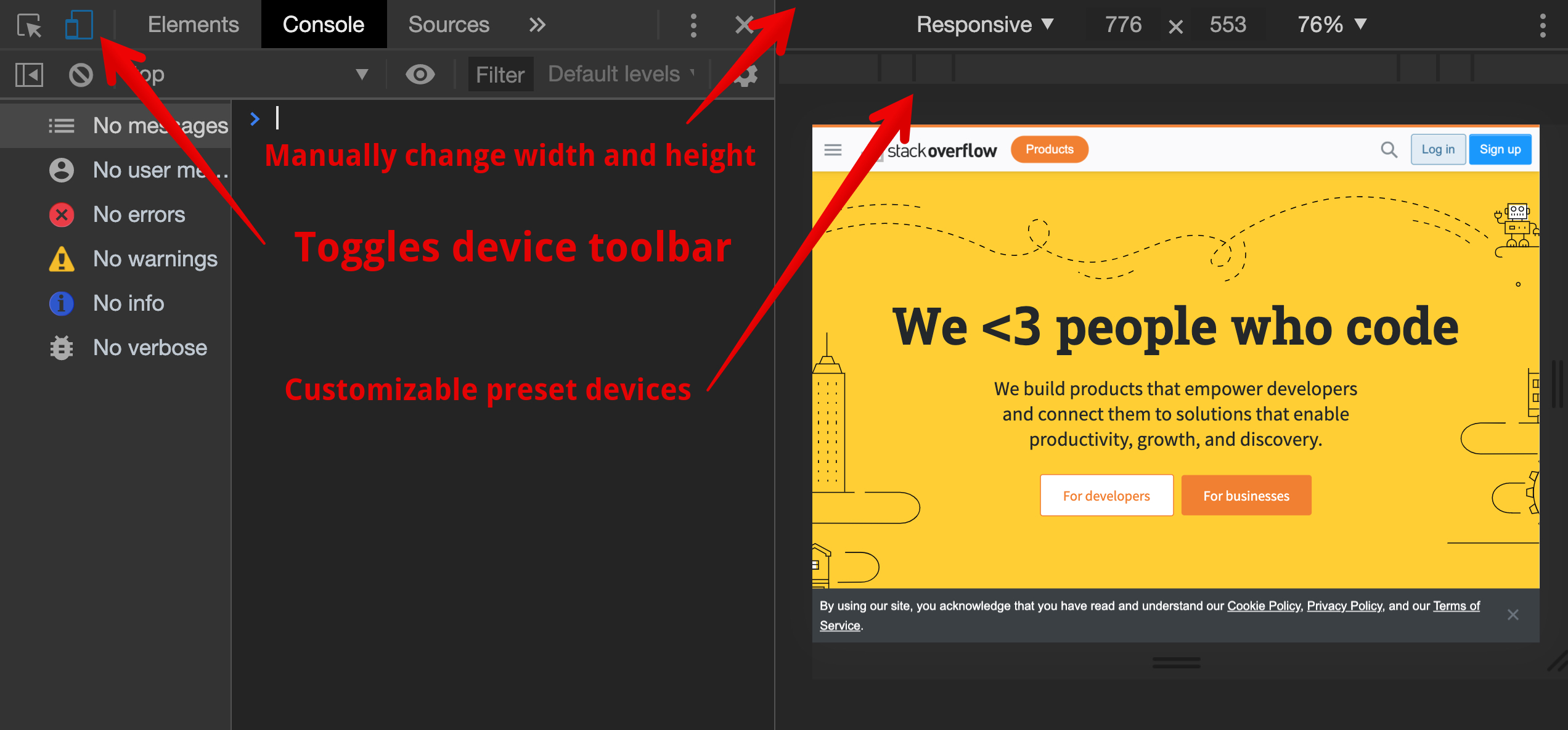
This particular tool allows you to easily view your webpage as if it is one of the preset devices.
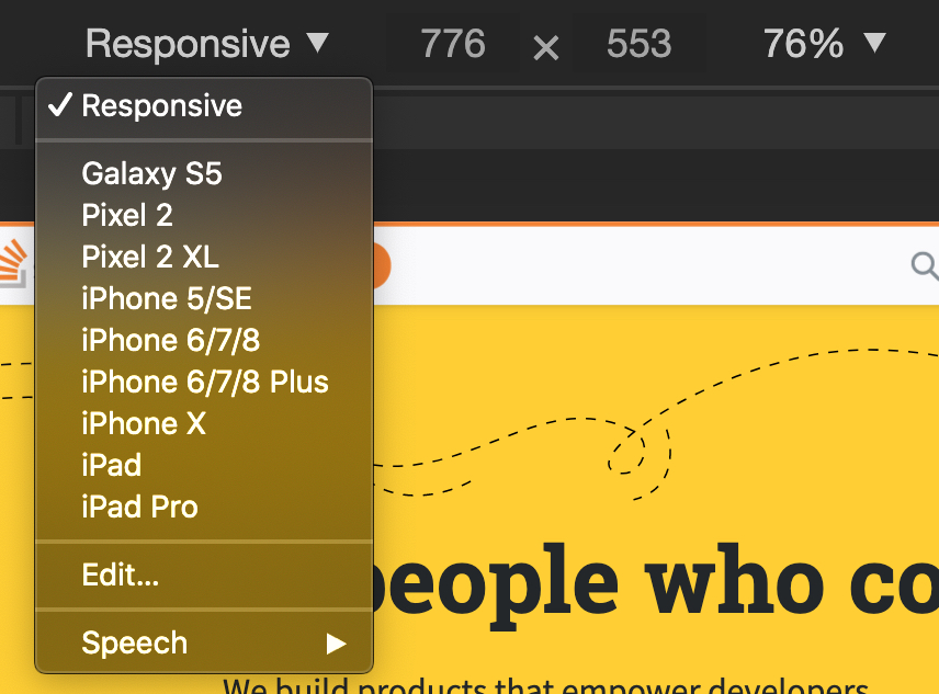
Clicking on one of the options, setting the size manually, or using the toolbar changes the size of the viewable area (or "viewport") of the website. This lets you see what happens to the content on different screen sizes.
To learn more about the Chrome Developer Tools, visit the Chrome DevTools page.
# Using Media Queries
A media query is a feature of CSS3 that enables webpage content to adapt to different screen sizes and devices. It consists of a media type and zero or more expressions that match the type and conditions of a particular media feature such as device width or screen resolution.
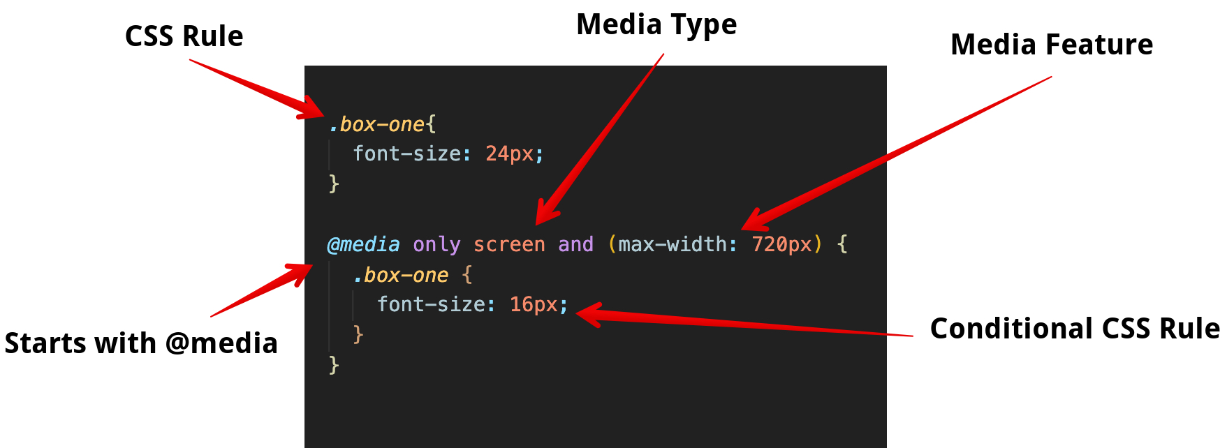
In the example, we have a class of box-one that we have set the font-size property to 24px. A media query is then used to change the font-size property to 16px when the screen's width is greater than 720px.
# Media Types
Media types describe the general category of a device. Except when using the not or only logical operators, the media type is optional and the all type will be used.
@media only screen;
Use the only keyword to hide CSS Rules from older browsers. If the browser does not support that particular media feature, it will ignore all of the CSS Rules inside that media query.
| Media Types | Description |
|---|---|
| all | Suitable for all devices |
| Intended for paged documents viewed in print preview mode. | |
| screen | Intended for screens. |
| speech | Intended for screen readers. |
The and keyword combines a media feature with a media type or other media feature. In the example below we are combining our media type screen with our media feature (max-width: 720px).
@media only screen and (max-width: 720px) {
}
2
Media features are surrounded by parentheses and describe specific characteristics (e.g. "the device is a screen") or conditions (e.g., "the screen is at least 720 pixels wide"). When a browser has these features then the styling will be applied.
Another way to think of a media query is that it is like an if statement for CSS. The conditions are sometimes called breakpoints - at that threshold (a max-width for example), the design would "break".
The DevTools allow you to adjust the width of your webpage and see where the styling breaks. Based on that information, you can fine tune your CSS to ensure a great user experience regardless of the device.
Below are some media queries for common devices:
/* Smartphones (portrait and landscape) ---------- */
@media screen and (min-width: 320px) and (max-width: 480px) {
  /* styles */
}
/* Smartphones (portrait) ---------- */
@media screen and (max-width: 320px) {
  /* styles */
}
/* Smartphones (landscape) ---------- */
@media screen and (min-width: 321px) {
  /* styles */
}
/* Tablets, iPads (portrait and landscape) ---------- */
@media screen and (min-width: 768px) and (max-width: 1024px) {
  /* styles */
}
/* Tablets, iPads (portrait) ---------- */
@media screen and (min-width: 768px) {
  /* styles */
}
/* Tablets, iPads (landscape) ---------- */
@media screen and (min-width: 1024px) {
  /* styles */
}
/* Desktops and laptops ---------- */
@media screen and (min-width: 1224px) {
  /* styles */
}
/* Large screens ---------- */
@media screen and (min-width: 1824px) {
  /* styles */
}
2
3
4
5
6
7
8
9
10
11
12
13
14
15
16
17
18
19
20
21
22
23
24
25
26
27
28
29
30
31
32
# Summary
# Training Exercises
To solidify your knowledge, here are a set of exercises that will require you to use the techniques you've just learned in the lesson above.
They are organized into small, medium, and large sized problems. The small exercises will be very similar to the examples in the lesson. If you get stuck, refer to the relevant section above. The medium exercises will require you to combine concepts. The lesson may not have a single, specific example for you to reference. The large exercises are more open-ended and may require you to search the web for additional material.
# Small
Use the Following HTML to do the small exercises
HTML
<!DOCTYPE html>
<html>
  <head>
    <style>
      .box {
        background-color: darkred;
        color: gold;
        width: 150px;
        height: 150px;
        margin: 16px;
        text-align: center;
        font-size: 2rem;
      }

      .box-of-boxes {
        display: flex;
      }
    </style>
  </head>
  <body>
    <div class="box-of-boxes">
      <div class="box box-one">1</div>
      <div class="box box-two">2</div>
      <div class="box box-three">3</div>
      <div class="box box-four">4</div>
    </div>
  </body>
</html>
2
3
4
5
6
7
8
9
10
11
12
13
14
15
16
17
18
19
20
21
22
23
24
25
26
27
28
# Change the Width and Height of a Box
When the Window is Larger than 1100px:
box-oneshould have a width of 200pxbox-threeshould have a height of *400px
# Change a Color of a Box
When the Window is smaller than 720px:
box-twoshould be colored bluebox-threeshould be colored green
# In-between
When the Window is larger than 720px but smaller than 1100px:
box-fourshould have a width of 100px- All boxes should height of green
# Large
# Mobile First Webpage
Create an about me webpage. You can also use any webpage you have created from a previous exercise.
- Using Chrome's developer tools to view your page as a mobile site.
- Add styling to ensure that it is designed for comfortable use on a mobile device (320px).
- Use a media query to scale up your webpage to be viewed on a tablet (720px).
- Add another media query to scale up your webpage to be view on a laptop (1220px).
Bonus Add media query users who may 'print' your website.
# Interview Questions
# Fundamentals
- What are Media Types?
- Why is a responsive design important when building a website?
- What does 'Mobile First' mean?
# Bugfix
Fix the following code:
@media only screen and (min-width: 720px) and @media screen (max-width: 1220px) {
    heading {
        color: red;
    }

    body {
        background-color: white;
    }
2
3
4
5
6
7
8
9
10
Solution
@media only screen and (min-width: 720px) and (max-width: 1220px) {
    heading {
        color: red;
    }

    body {
        background-color: white;
    }
2
3
4
5
6
7
8
You don't need to declare @media screen again in the media query. You can continue to add media features with the keywords and and or.
# Conceptual
- How does a media query decide when to applied the CSS styles contained within?
- What happens when multiple media queries are applicable? (For example, when using a screen that is 1000 pixels wide, what happens if your CSS contains two media queries, one for
min-width: 600pxand another formin-width: 800px?)
# Architect
- How would you use a media query use to create a navigation bar that is responsive.