# Grid Layout
# Learning Objectives
After completing this lesson, you will be able to:
- Create grid-based layouts with rows and columns using the grid layout module
- Customize grid items by positioning, reordering, and resizing
# Lesson
# Overview
CSS Grid Layout allows you to create a two-dimensional grid system. Simple row/column grid systems are a common way to lay out user interfaces. This is an overview of grid and how to use it.
# Grid Container
Using grid starts with container element set to display: grid. All of the direct children elements will become grid items.
By default, the grid will be setup in a single column and row. As we go into more detail, you will learn how to create more and more complex grids by adding properties to the grid container and its items.
# Columns
Columns are defined using the grid-template-columns property. It accepts multiple values for each column. So to create 4 columns at 100px per column, use the following code:
.grid {
  display: grid;
  grid-template-columns: 100px 100px 100px 100px;
}
2
3
4
The grid property interacts with direct children elements, so we will include a handful of <div> child elements.
<div class="grid">
  <div>1</div>
  <div>2</div>
  <div>3</div>
  <div>4</div>
  <div>5</div>
  <div>6</div>
</div>
2
3
4
5
6
7
8
The grid will break the children to a new row once all four columns have been filled (see 5 & 6 above).
# fr Unit
The fr unit measurement can be used instead of pixels on the grid-template-columns property value. It creates a flexible space that evenly fills the grid container.
grid-template-columns: 1fr 1fr 1fr 1fr;
# Repeat
You an also use the repeat() CSS function to define repeated patterns more easily. The first argument is how many times you want it to repeat. The second argument is the size.
grid-template-columns: repeat(6, 1fr);
Mix and Match
The grid-template-columns allows a mixture of values in whatever you desire. As we continue in this lesson you will begin to see more and more complex grids.
grid-template-columns: 2fr 500px 1fr;
# Rows
At this point, rows will implicitly be generated by how many elements are in the container. The grid-template-rows property can also be used. It acts similar to the columns property but defines the y-axis.
grid-template-rows: 50px 50px 50px;
You can also use the grid-auto-rows property to set the height of the rows:
grid-template-columns: repeat(3, 1fr);
grid-auto-rows: 100px;
2
# Lines
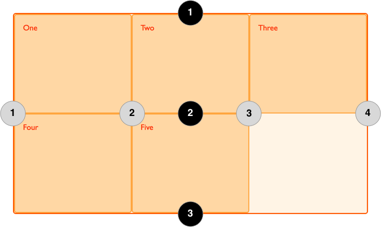
Credit: MDM Web Docs - Basic Concepts of grid layout
When a grid is generated, the lines that divide each column and row are assigned to a number from left-to-right (columns) and top-to-bottom (rows). You can size grid items by defining the start and end positions by row and column on the grid item.
You can hard-code each grid item using the following properties:
.grid-item-1 {
  grid-column-start: 1;
  grid-column-end: 4;
  grid-row-start: 1;
  grid-row-end: 2;
}
2
3
4
5
6
# Gutters
Gutters, also known as allies, are the spaces between cells. These can be controlled with column-gap and row-gap properties, or the gap using shorthand.
row-gap: 20px;
column-gap: 40px;
2
The gap shorthand property can have one value for both row and column, or two values (first is row, second is columns)
gap: 20px 40px;
Or you can use a single value which will be used for row and column gaps.
gap: 40px;
# Summary
These are just the very basics of Grid Layout. There are more properties and tools for using this powerful CSS module linked in additional resources.
For now, you've learned Grid layout is a powerful tool for creating complex layout using CSS. A container is set to display: grid and the direct children are sorted into a grid automatically. The columns and rows can be customized, items can be positioned manually using the grid lines, and gutters can be resized.
# Training Exercises
To solidify your knowledge, here are a set of exercises that will require you to use the techniques you've just learned in the lesson above.
They are organized into small, medium, and large sized problems. The small exercises will be very similar to the examples in the lesson. If you get stuck, refer to the relevant section above. The medium exercises will require you to combine concepts. The lesson may not have a single, specific example for you to reference. The large exercises are more open-ended and may require you to search the web for additional material.
# Small
# Tick-Tac-Toe Board
Create a tick-tack-toe board using Grid Layout. Alternate the colors of every other cell to create a checkerboard pattern.
- Make each tile 50x50 pixels
- Use
border: 3px solid black;to create board effect (you can leave the outside border)
Tic Tac Toe Solution
<!DOCTYPE html>
<html lang="en">
  <head>
    <meta charset="UTF-8" />
    <meta name="viewport" content="width=device-width, initial-scale=1.0" />
    <title>Tic-Tac-Toe Solution</title>
    <style>
      .board {
        display: grid;
        grid-template-columns: repeat(3, 50px);
      }

      .board > div {
        width: 50px;
        height: 50px;
        border: 3px solid black;
      }
    </style>
  </head>
  <body>
    <div class="board">
      <div></div>
      <div></div>
      <div></div>
      <div></div>
      <div></div>
      <div></div>
      <div></div>
      <div></div>
      <div></div>
    </div>
  </body>
</html>
2
3
4
5
6
7
8
9
10
11
12
13
14
15
16
17
18
19
20
21
22
23
24
25
26
27
28
29
30
31
32
33
# Medium
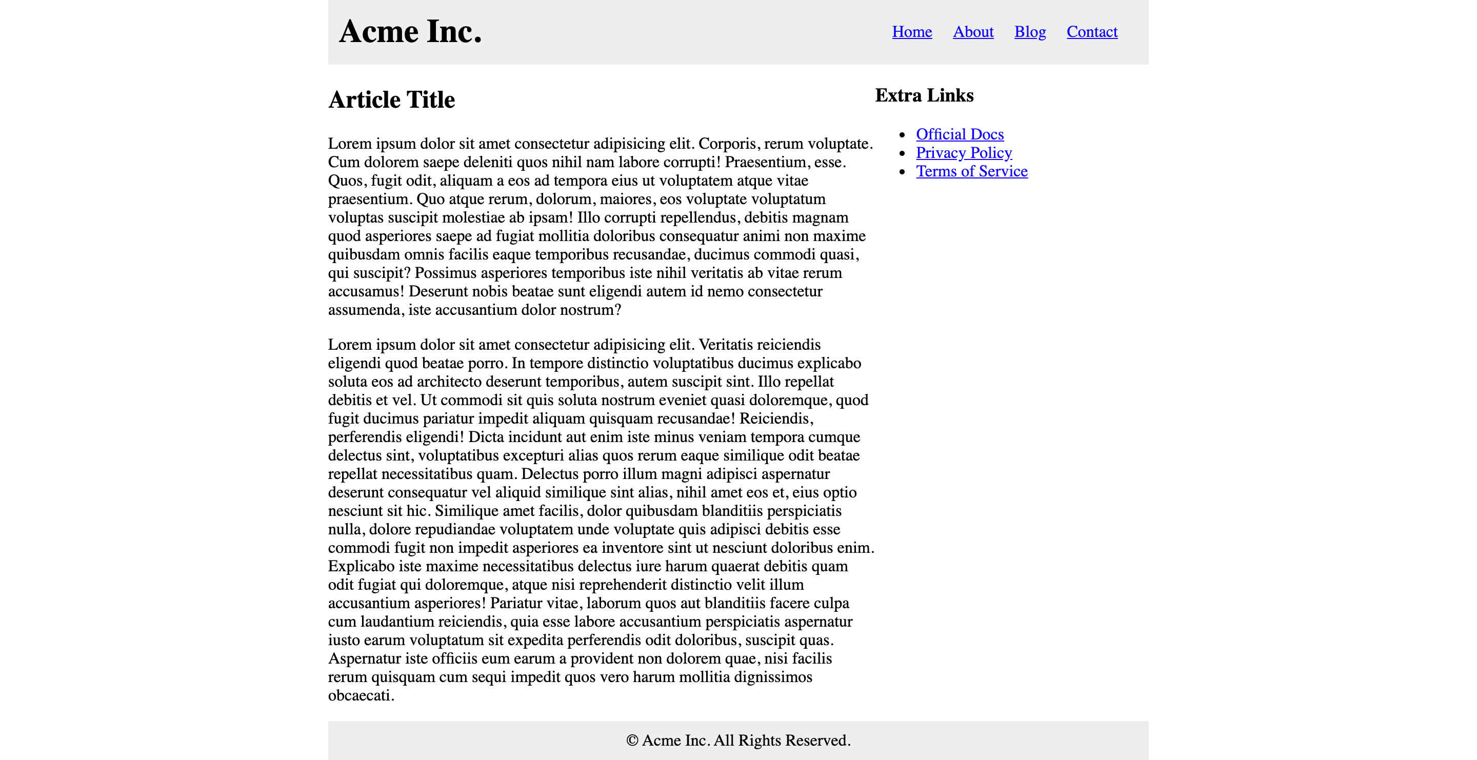
# Blog Layout
Create a basic blog layout page using Grid Layout with the following properties:
- Max width of 800px (centered)
- The header, main content, sidebar and footer should all be in one grid container and positioned manually
- The header menu can be aligned with flexbox
Here is a preview of what it should look like:
Blog Layout Solution
<!DOCTYPE html>
<html lang="en">
<head>
<meta charset="UTF-8" />
<meta name="viewport" content="width=device-width, initial-scale=1.0" />
<title>Blog Layout Solution</title>
<style>
body {
margin: 0;
}
h1 {
line-height: 0;
}
.grid {
display: grid;
grid-template-columns: 1fr 1fr 1fr;
max-width: 800px;
margin: 0 auto;
}
.grid__header {
background-color: #eee;
padding: 10px;
grid-column-start: 1;
grid-column-end: 4;
grid-row-start: 1;
grid-row-end: 2;
}
.grid__body {
grid-column-start: 1;
grid-column-end: 3;
grid-row-start: 2;
grid-row-end: 3;
}
.grid__sidebar {
grid-column-start: 3;
grid-column-end: 4;
grid-row-start: 2;
grid-row-end: 3;
}
.grid__footer {
background-color: #eee;
padding: 10px;
text-align: center;
grid-column-start: 1;
grid-column-end: 4;
grid-row-start: 3;
grid-row-end: 4;
}
.header {
display: flex;
align-items: center;
justify-content: space-between;
}
.menu {
list-style-type: none;
margin: 0;
}
.menu > li {
float: left;
margin-right: 20px;
}
</style>
</head>
<body>
<div class="grid">
<header class="grid__header header">
<h1>Acme Inc.</h1>
<ul class="menu">
<li><a href="#">Home</a></li>
<li><a href="#">About</a></li>
<li><a href="#">Blog</a></li>
<li><a href="#">Contact</a></li>
</ul>
</header>
<main class="grid__body">
<h2>Article Title</h2>
<p>
Lorem ipsum dolor sit amet consectetur adipisicing elit. Corporis,
rerum voluptate. Cum dolorem saepe deleniti quos nihil nam labore
corrupti! Praesentium, esse. Quos, fugit odit, aliquam a eos ad
tempora eius ut voluptatem atque vitae praesentium. Quo atque rerum,
dolorum, maiores, eos voluptate voluptatum voluptas suscipit molestiae
ab ipsam! Illo corrupti repellendus, debitis magnam quod asperiores
saepe ad fugiat mollitia doloribus consequatur animi non maxime
quibusdam omnis facilis eaque temporibus recusandae, ducimus commodi
quasi, qui suscipit? Possimus asperiores temporibus iste nihil
veritatis ab vitae rerum accusamus! Deserunt nobis beatae sunt
eligendi autem id nemo consectetur assumenda, iste accusantium dolor
nostrum?
</p>
<p>
Lorem ipsum dolor sit amet consectetur adipisicing elit. Veritatis
reiciendis eligendi quod beatae porro. In tempore distinctio
voluptatibus ducimus explicabo soluta eos ad architecto deserunt
temporibus, autem suscipit sint. Illo repellat debitis et vel. Ut
commodi sit quis soluta nostrum eveniet quasi doloremque, quod fugit
ducimus pariatur impedit aliquam quisquam recusandae! Reiciendis,
perferendis eligendi! Dicta incidunt aut enim iste minus veniam
tempora cumque delectus sint, voluptatibus excepturi alias quos rerum
eaque similique odit beatae repellat necessitatibus quam. Delectus
porro illum magni adipisci aspernatur deserunt consequatur vel aliquid
similique sint alias, nihil amet eos et, eius optio nesciunt sit hic.
Similique amet facilis, dolor quibusdam blanditiis perspiciatis nulla,
dolore repudiandae voluptatem unde voluptate quis adipisci debitis
esse commodi fugit non impedit asperiores ea inventore sint ut
nesciunt doloribus enim. Explicabo iste maxime necessitatibus delectus
iure harum quaerat debitis quam odit fugiat qui doloremque, atque nisi
reprehenderit distinctio velit illum accusantium asperiores! Pariatur
vitae, laborum quos aut blanditiis facere culpa cum laudantium
reiciendis, quia esse labore accusantium perspiciatis aspernatur iusto
earum voluptatum sit expedita perferendis odit doloribus, suscipit
quas. Aspernatur iste officiis eum earum a provident non dolorem quae,
nisi facilis rerum quisquam cum sequi impedit quos vero harum mollitia
dignissimos obcaecati.
</p>
</main>
<aside class="grid__sidebar">
<h3>Extra Links</h3>
<ul>
<li><a href="#">Official Docs</a></li>
<li><a href="#">Privacy Policy</a></li>
<li><a href="#">Terms of Service</a></li>
</ul>
</aside>
<footer class="grid__footer">
© Acme Inc. All Rights Reserved.
</footer>
</div>
</body>
</html>
2
3
4
5
6
7
8
9
10
11
12
13
14
15
16
17
18
19
20
21
22
23
24
25
26
27
28
29
30
31
32
33
34
35
36
37
38
39
40
41
42
43
44
45
46
47
48
49
50
51
52
53
54
55
56
57
58
59
60
61
62
63
64
65
66
67
68
69
70
71
72
73
74
75
76
77
78
79
80
81
82
83
84
85
86
87
88
89
90
91
92
93
94
95
96
97
98
99
100
101
102
103
104
105
106
107
108
109
110
111
112
113
114
115
116
117
118
119
120
121
122
123
124
125
126
127
128
129
130
131
132
133
134
135
136
137
138
139
# Large
# Responsive Image Gallery
Create a responsive image gallery using the Grid Layout

- 1 column for the default (mobile)
- 2 columns for screens over 400px and under 799px wide
- 4 columns for screens over 800px wide
- Use the Lorem Picsum service to generate images
- Set the images to
width: 100%,height: autoto fill the images into the columns - Add even padding on all sides of the grid cells (there is more than one way to achieve this)
# Interview Questions
# Fundamentals
- Have you used CSS Grid before? What are the differences between it and Flexbox?
# Bugfix
Show them code and ask them what they would change to make it exhibit the correct behavior.
# Conceptual
Ask them how a technique or technology works.
- How would you create a responsive web layout using the CSS Grid module?
# Architect
Ask them how they would build a particular feature or set of features.