# Flexbox
# Learning Objectives
After completing this lesson, you will be able to use the Flexbox layout module to do the following things:
- Align and distribute HTML elements (items) vertically and horizontally
- Adjust the size and flow of items
- Evenly distribute and fit items in a container
- Reorder items
- Perfectly center an item vertically and horizontally with Flexbox
- Create the holy grail layout
# Lesson
# Overview
The Flexbox Layout (Flexible Box) module (a W3C Candidate Recommendation as of October 2017) aims at providing a more efficient way to lay out, align and distribute space among items in a container, even when their size is unknown and/or dynamic (thus the word "flex")
Basically, Flexbox is a CSS module that allows you to create layouts in a more simple and flexible way than previous solutions like using float and position to rearrange items manually. With Flexbox, the container element tells the browser how to distribute, align, and space the children elements automatically.
Here are a few main advantages to Flexbox:
- Simple HTML
- Allows vertical alignment (which wasn't possible before Flexbox)
- Allows even column heights (and make responsive)
Here is a visual overview of Flexbox and how it works:
 Image Credit: A Complete Guide to Flexbox | CSS Tricks
# Basic Example
Here is a basic example of Flexbox using the default properties.
<div class="container">
  <div>1</div>
  <div>2</div>
  <div>3</div>
</div>
2
3
4
5
.container {
  display: flex;
}
2
3
As you can see, the container element is given a display: flex CSS property and the children elements are arranged from left-to-right.
TIP
Flexbox only effects direct children elements, any elements nested deeper are not effected by the top container's Flexbox properties.
# Container Properties
# display
Flexbox is made up of CSS properties on the container and children elements. As seen in the example above, you put display: flex on the container element for all the direct children to be flex content.
# flex-direction
Values: row (default), row-reverse, column, or column-reverse
Flex direction determines the direction of the content, also known as the axis. The horizontal axis (X) is called "row" and the vertical axis (Y) is called a "column". Notice that both can be reversed by prefixing -reverse on either property.
.container {
  display: flex;
  flex-direction: row-reverse;
}
2
3
4
# flex-wrap
Values: no-wrap (default), wrap, or wrap-reverse
The flex-wrap property determines what flex items will do when they occupy more space then the container's width. By default, the items will not wrap and continue in the same direction no matter the width of the parent container. If you want the items to wrap onto a new line, you can use the wrap value as well as the wrap-reverse for a similar effect (in reverse).
.container {
  display: flex;
  flex-wrap: wrap;
}
2
3
4
TIP
flex-flow shorthand
The flex-flow property allows you to write out the direction and wrap properties in one line of CSS. Just be careful that you fully understand both properties before using this property. Example: flex-flow: row-reverse || wrap;
# justify-content
Values: flex-start (default), center, flex-end, space-between, or space-around
The justify-content property justifies the content of the flex items by aligning the items vertically along the outer margins. The different values best describe where the spacing between items will go. For example, the space-between will justify the flex items by adding an even amount of whitespace between elements. You can experiment with all the properties to better understand how they work.
.container {
  display: flex;
  justify-content: space-between;
}
2
3
4
# align-items
Values: stretch (default), flex-start, flex-end, center, and baseline
The align-items property defines how the flex items are aligned and positioned against the cross axis per line.
# align-content
Values: flex-start (default), flex-end, center, stretch, space-around, and space-between
The align-content property aligns the content based on any extra space along the cross access.
The container properties make up the majority of the work you will typically do with Flexbox.
# Item Properties
The following properties are for flex items that are direct children inside a flex container.
# order
Values: <integer> (default is 0)
The order property allows you to manually set the order which the flex items appear in their container. The default with be by the source order, the order in which the items are defined in the HTML. Note that it requires an integer value however negative values work as well.
# flex-grow
Values: <number> (default is 0)
The flex-grow property allows you to change the size of the flex item along the main axis. The value is proportional to the items in the container's available space.
For example, if all of the items are set to flex-grow: 1 the space remaining inside the container will be equally distributed. When one child is set to flex-grow: 2 the remaining space will take up double the space as the others (if there is room).
# flex-shrink
Values: <number> (default is 0)
Flex shrink does the opposite as flex-grow, it allows you to shrink the amount of space the child fills up in the container.
# flex-basis
Values: <length> | auto
The flex-basis property defines the default size of a child item before the rest of the containers available space is distributed. It can be any standard CSS length (percentage, pixels, rems, etc...). The keyword auto is also supported and will read the width and height properties.
TIP
flex shorthand
The flex property is shorthand for setting flex-grow, flex-shrink, and flex-basis. The first value is required and sets the flex-grow property and the second and third options values are optional (defaulting to 0 1 auto). Again, it's important to understand the properties before switching to the shorthand syntax but using it can be helpful in setting smart default values with less code.
# align-self
Values: auto (default), or flex-start, flex-end, center, baseline, or stretch
The align-self property allows you to overwrite an individual flex item's position regarding the align-items property.
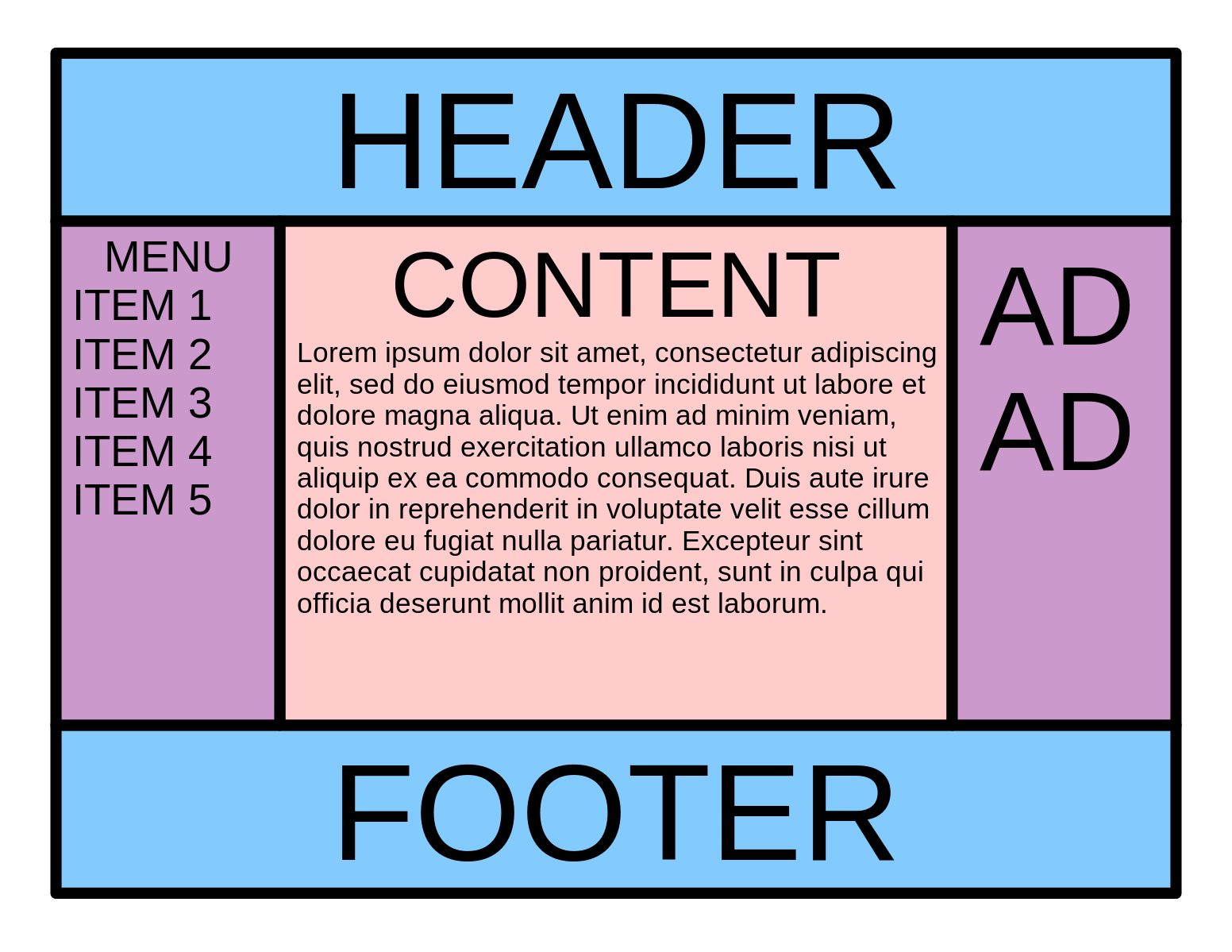
# Holy Grail Layout Example
Let's build something with Flexbox to get an idea of how to use all of these properties together to create a website.
The Holy Grail Layout is a web design layout problem that has been tricky to solve over the years. Flexbox is a great (newer) solution for creating this with ease.
Here is a preview of the final layout we want to create:
First, you setup the HTML and some basic CSS to get started.
View Starter HTML File
<!DOCTYPE html>
<html lang="en">
  <head>
    <meta charset="UTF-8" />
    <meta name="viewport" content="width=device-width, initial-scale=1.0" />
    <meta http-equiv="X-UA-Compatible" content="ie=edge" />
    <title>Holy Grail Layout</title>
    <style>
      body {
        font-family: Sans-Serif;
        margin: 0;
        font-size: 20px;
      }

      h1,
      h2,
      h3,
      h4,
      h5 {
        margin: 0;
      }

      .header,
      .footer,
      .main,
      .sidebar-left,
      .sidebar-right {
        padding: 20px;
      }

      .header,
      .footer {
        background-color: #83caff;
      }

      .sidebar-left,
      .sidebar-right {
        background-color: #cb99cc;
      }

      .main {
        background-color: #ffcccc;
      }
    </style>
  </head>
  <body>
    <div class="layout">
      <header class="header">
        <h1>Header</h1>
      </header>
      <section class="content">
        <main class="main">
          <h2>Content</h2>
          <p>
            Lorem ipsum dolor sit, amet consectetur adipisicing elit. Odit
            delectus minus error neque quam reiciendis voluptate saepe quis
            accusantium! Officia ab provident doloribus aliquid perferendis
            quaerat eaque iusto, dolor temporibus, recusandae vel autem, alias
            laudantium optio error quam aliquam ad vero. Dolore dignissimos
            laboriosam obcaecati error dolorum numquam molestias enim!
          </p>
        </main>
        <aside class="sidebar-left">
          <h3>Menu</h3>
          <ul>
            <li>Item 1</li>
            <li>Item 2</li>
            <li>Item 3</li>
            <li>Item 4</li>
            <li>Item 5</li>
          </ul>
        </aside>
        <aside class="sidebar-right">
          <h4>Ad</h4>
          <h4>Ad</h4>
          <h4>Ad</h4>
        </aside>
      </section>
      <footer class="footer">
        <h1>Footer</h1>
      </footer>
    </div>
  </body>
</html>
2
3
4
5
6
7
8
9
10
11
12
13
14
15
16
17
18
19
20
21
22
23
24
25
26
27
28
29
30
31
32
33
34
35
36
37
38
39
40
41
42
43
44
45
46
47
48
49
50
51
52
53
54
55
56
57
58
59
60
61
62
63
64
65
66
67
68
69
70
71
72
73
74
75
76
77
78
79
80
81
82
83
84
85
86
87
88
89
90
91
92
93
94
95
96
97
98
99
100
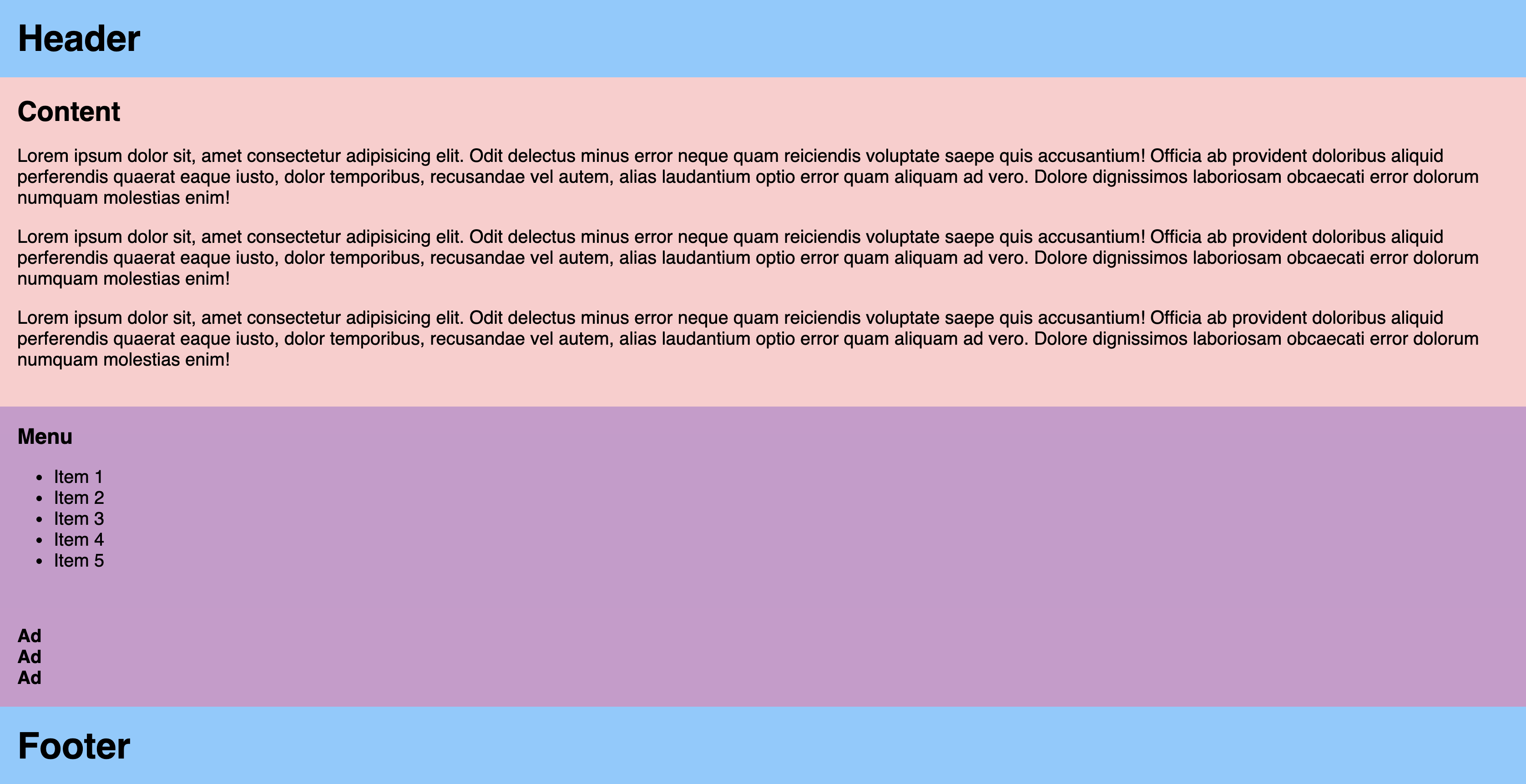
As you can see, the content is stacked top down using the default display: block formatting. But the footer is not properly fixed to the bottom of the screen.
Creating the final solution less steps then you would expect. The main layout (header, content, footer) needs to be a flex container in the column direction, and the content (main and sidebars) needs to be a flex in the row direction (default).
.layout {
  min-height: 100vh;
  display: flex;
  flex-direction: column;
}

.content {
  display: flex;
  flex: 1;
}
2
3
4
5
6
7
8
9
10
TIP
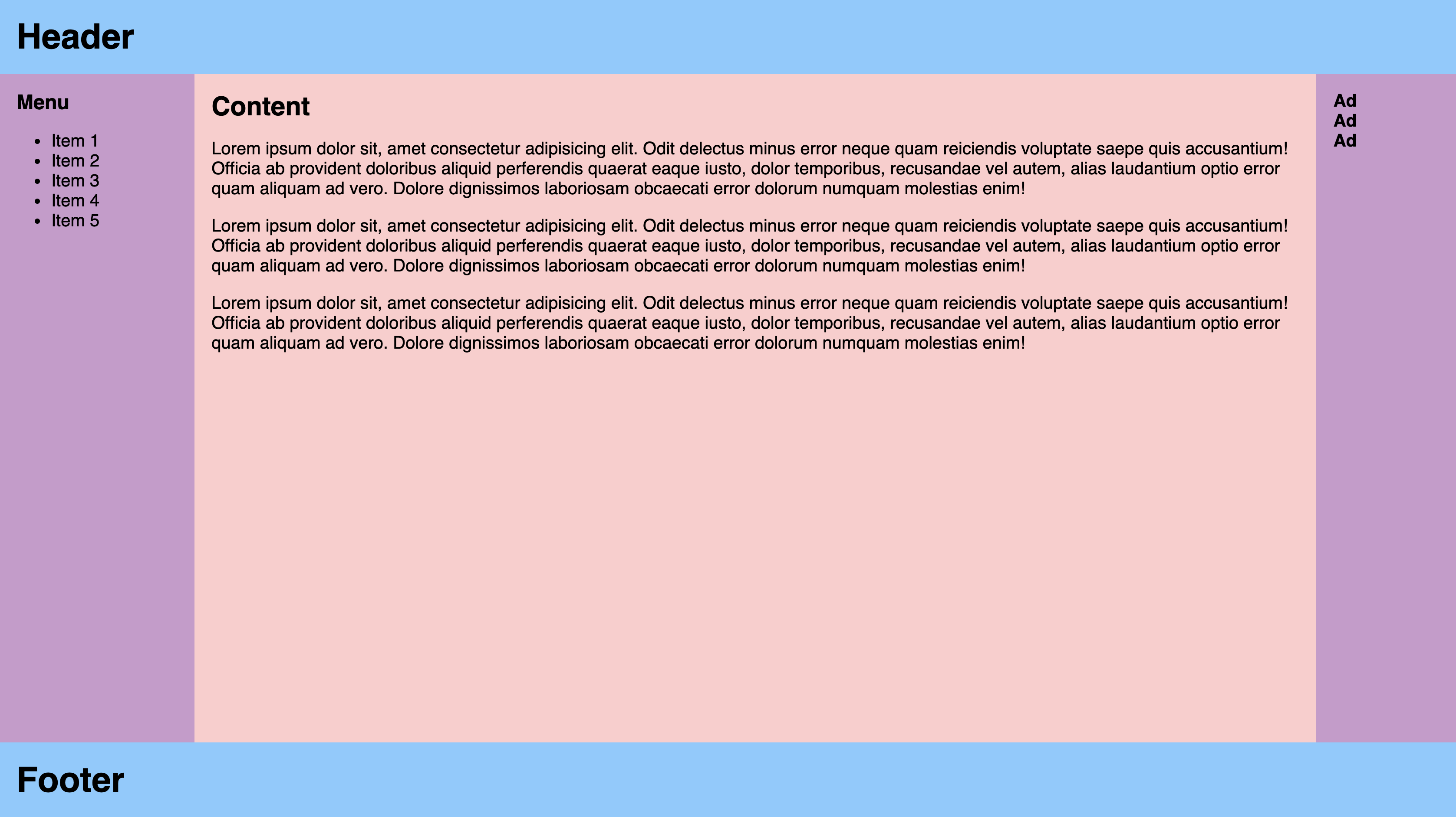
flex: 1 is shorthand and will set the growth property so that the content will fill the container of the column.
You'll notice the sidebars are not in the same order as the original diagram. Thanks to flexbox we can define the order with CSS. It's also important to give the sidebars some width to give it a more balanced look.
.sidebar-left {
  order: 1;
  width: 30%;
}

.main {
  order: 2;
}

.sidebar-right {
  order: 3;
  width: 20%;
}
2
3
4
5
6
7
8
9
10
11
12
13
Here's what the final solution will look like.
View holy grail layout final solution
<!DOCTYPE html>
<html lang="en">
  <head>
    <meta charset="UTF-8" />
    <meta name="viewport" content="width=device-width, initial-scale=1.0" />
    <meta http-equiv="X-UA-Compatible" content="ie=edge" />
    <title>Holy Grail Layout</title>
    <style>
      body {
        font-family: Sans-Serif;
        margin: 0;
        font-size: 20px;
      }

      h1,
      h2,
      h3,
      h4,
      h5 {
        margin: 0;
      }

      .header,
      .footer,
      .main,
      .sidebar-left,
      .sidebar-right {
        padding: 20px;
      }

      .header,
      .footer {
        background-color: #83caff;
      }

      .sidebar-left,
      .sidebar-right {
        background-color: #cb99cc;
      }

      .main {
        background-color: #ffcccc;
      }

      .layout {
        min-height: 100vh;
        display: flex;
        flex-direction: column;
      }

      .content {
        display: flex;
        flex: 1;
      }

      .sidebar-left {
        order: 1;
        width: 30%;
      }

      .main {
        order: 2;
      }

      .sidebar-right {
        order: 3;
        width: 20%;
      }
    </style>
  </head>
  <body>
    <div class="layout">
      <header class="header">
        <h1>Header</h1>
      </header>
      <section class="content">
        <main class="main">
          <h2>Content</h2>
          <p>
            Lorem ipsum dolor sit, amet consectetur adipisicing elit. Odit
            delectus minus error neque quam reiciendis voluptate saepe quis
            accusantium! Officia ab provident doloribus aliquid perferendis
            quaerat eaque iusto, dolor temporibus, recusandae vel autem, alias
            laudantium optio error quam aliquam ad vero. Dolore dignissimos
            laboriosam obcaecati error dolorum numquam molestias enim!
          </p>
          <p>
            Lorem ipsum dolor sit, amet consectetur adipisicing elit. Odit
            delectus minus error neque quam reiciendis voluptate saepe quis
            accusantium! Officia ab provident doloribus aliquid perferendis
            quaerat eaque iusto, dolor temporibus, recusandae vel autem, alias
            laudantium optio error quam aliquam ad vero. Dolore dignissimos
            laboriosam obcaecati error dolorum numquam molestias enim!
          </p>
          <p>
            Lorem ipsum dolor sit, amet consectetur adipisicing elit. Odit
            delectus minus error neque quam reiciendis voluptate saepe quis
            accusantium! Officia ab provident doloribus aliquid perferendis
            quaerat eaque iusto, dolor temporibus, recusandae vel autem, alias
            laudantium optio error quam aliquam ad vero. Dolore dignissimos
            laboriosam obcaecati error dolorum numquam molestias enim!
          </p>
        </main>
        <aside class="sidebar-left">
          <h3>Menu</h3>
          <ul>
            <li>Item 1</li>
            <li>Item 2</li>
            <li>Item 3</li>
            <li>Item 4</li>
            <li>Item 5</li>
          </ul>
        </aside>
        <aside class="sidebar-right">
          <h4>Ad</h4>
          <h4>Ad</h4>
          <h4>Ad</h4>
        </aside>
      </section>
      <footer class="footer">
        <h1>Footer</h1>
      </footer>
    </div>
  </body>
</html>
2
3
4
5
6
7
8
9
10
11
12
13
14
15
16
17
18
19
20
21
22
23
24
25
26
27
28
29
30
31
32
33
34
35
36
37
38
39
40
41
42
43
44
45
46
47
48
49
50
51
52
53
54
55
56
57
58
59
60
61
62
63
64
65
66
67
68
69
70
71
72
73
74
75
76
77
78
79
80
81
82
83
84
85
86
87
88
89
90
91
92
93
94
95
96
97
98
99
100
101
102
103
104
105
106
107
108
109
110
111
112
113
114
115
116
117
118
119
120
121
122
123
124
125
And that's it! With a few lines of CSS we can create the holy grail layout with easy to read HTML and a mix of two flexbox containers and adjusting a few flexbox child items.
# Summary
Flexbox is a powerful tool for layout out and distributing space between elements. There are properties for the parent container, to control the children, and properties for the child items to adjust positioning, size, and shape. Now that the Flexbox module is well supported by browsers it is a great solution instead of the traditional floats, positioning, and/or table solutions.
# Training Exercises
To solidify your knowledge, here are a set of exercises that will require you to use the techniques you've just learned in the lesson above.
They are organized into small, medium, and large sized problems. The small exercises will be very similar to the examples in the lesson. If you get stuck, refer to the relevant section above. The medium exercises will require you to combine concepts. The lesson may not have a single, specific example for you to reference. The large exercises are more open-ended and may require you to search the web for additional material.
# Small
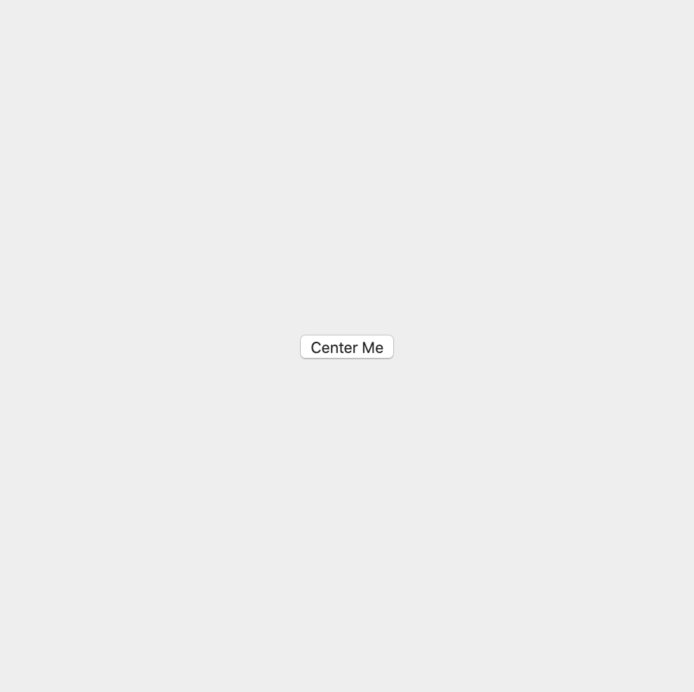
# Centered Button
Centering items is one of the most useful abilities Flexbox offers. Create a container that's 500px by 500px and center a button directly in the center using Flexbox.
Preview:
View Centered Button Solution
<!DOCTYPE html>
<html lang="en">
  <head>
    <meta charset="UTF-8" />
    <meta name="viewport" content="width=device-width, initial-scale=1.0" />
    <meta http-equiv="X-UA-Compatible" content="ie=edge" />
    <title>Centered Button</title>
    <style>
      .container {
        width: 500px;
        height: 500px;
        background-color: #eee;
        /* How to center flex items */
        display: flex;
        align-items: center;
        justify-content: center;
      }
    </style>
  </head>
  <body>
    <div class="container">
      <button>Center Me</button>
    </div>
  </body>
</html>
2
3
4
5
6
7
8
9
10
11
12
13
14
15
16
17
18
19
20
21
22
23
24
25
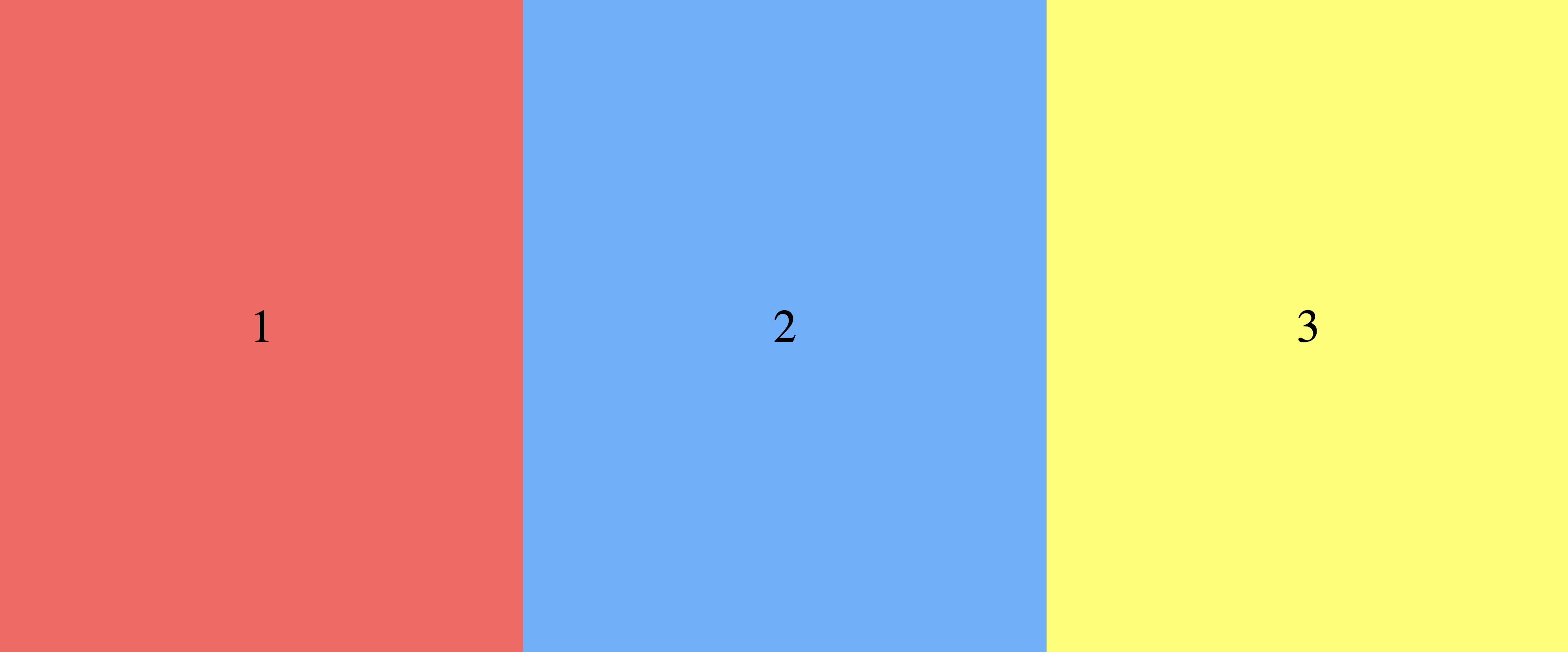
# Three Column Layout
Create a simple three column layout with numbers centered on each column.
Preview
TIP
You will have to nest display: flex properties, keep in mind which properties are related to the parent vs the child.
View Three Columns Exercise Solution
<!DOCTYPE html>
<html lang="en">
  <head>
    <meta charset="UTF-8" />
    <meta name="viewport" content="width=device-width, initial-scale=1.0" />
    <meta http-equiv="X-UA-Compatible" content="ie=edge" />
    <title>Three Columns Exercise Solution</title>
    <style>
      body {
        margin: 0;
      }
      .container {
        display: flex;
        /* The fixed height is to create the column layout */
        height: 700px;
      }
      .column {
        /*
         * Flex grow is for the parent flex container to
         * evenly distribute the columns
         */
        flex-grow: 1;
        /*
         * The column element is also a flex container so the following
         * properties can center the number
         */
        display: flex;
        align-items: center;
        justify-content: center;
      }
      .red {
        background-color: #ff5f5f;
      }
      .blue {
        background-color: #5fafff;
      }
      .yellow {
        background-color: #ffff5f;
      }
      .number {
        font-size: 50px;
      }
    </style>
  </head>
  <body>
    <div class="container">
      <div class="red column"><div class="number">1</div></div>
      <div class="blue column"><div class="number">2</div></div>
      <div class="yellow column"><div class="number">3</div></div>
    </div>
  </body>
</html>
2
3
4
5
6
7
8
9
10
11
12
13
14
15
16
17
18
19
20
21
22
23
24
25
26
27
28
29
30
31
32
33
34
35
36
37
38
39
40
41
42
43
44
45
46
47
48
49
50
51
52
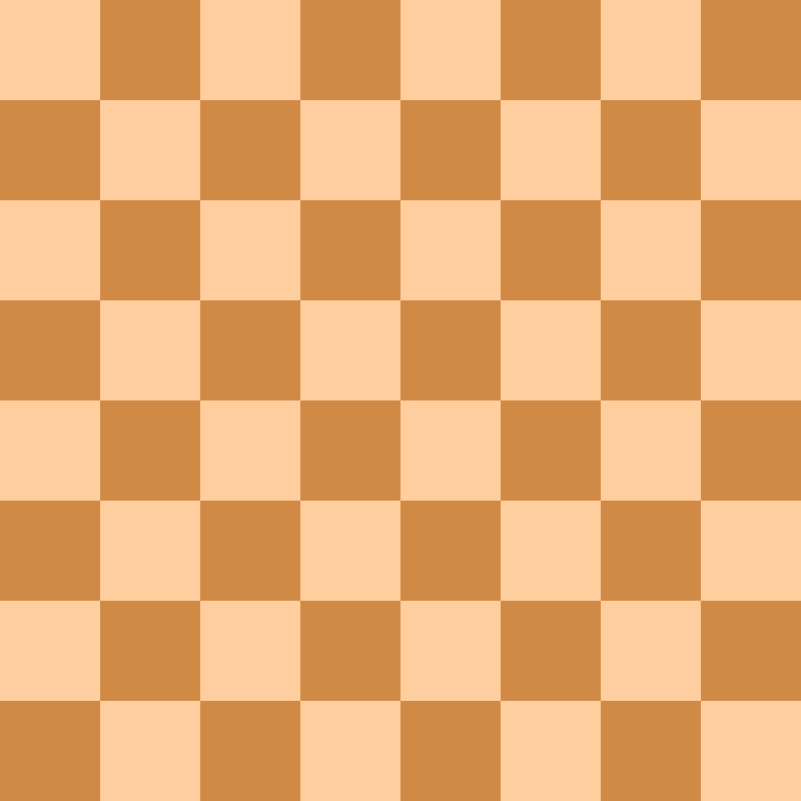
# Chessboard
Create a chessboard using Flexbox.
- Define 64 cells and wrap them around how ever flex containers are necessary
- Alternate the items' background colors (
#ffce9eand#d18a46) using your CSS knowledge - Display the items in a 8x8 grid using flexbox
View Chessboard Solution
<!DOCTYPE html>
<html lang="en">
  <head>
    <meta charset="UTF-8" />
    <meta name="viewport" content="width=i, initial-scale=1.0" />
    <title>5x5 Grid Solution</title>
    <style>
      .chessboard {
        display: flex;
        flex-wrap: wrap;
        width: 800px;
      }

      .row {
        display: flex;
      }

      .cell {
        background-color: #ffce9e;
        width: 100px;
        height: 100px;
      }

      .row:nth-child(odd) > .cell:nth-child(even) {
        background-color: #d18a46;
      }

      .row:nth-child(even) > .cell:nth-child(odd) {
        background-color: #d18a46;
      }
    </style>
  </head>
  <body>
    <div class="chessboard">
      <div class="row">
        <div class="cell"></div>
        <div class="cell"></div>
        <div class="cell"></div>
        <div class="cell"></div>
        <div class="cell"></div>
        <div class="cell"></div>
        <div class="cell"></div>
        <div class="cell"></div>
      </div>
    </div>
  </body>
</html>
2
3
4
5
6
7
8
9
10
11
12
13
14
15
16
17
18
19
20
21
22
23
24
25
26
27
28
29
30
31
32
33
34
35
36
37
38
39
40
41
42
43
44
45
46
47
48
49
50
51
52
53
54
55
56
57
58
59
60
61
62
63
64
65
66
67
68
69
70
71
72
73
74
75
76
77
78
79
80
81
82
83
84
85
86
87
88
89
90
91
92
93
94
95
96
97
98
99
100
101
102
103
104
105
106
107
108
109
110
111
112
113
114
115
116
117
# Medium
# Navigation
Recreate the navigation bar shown below using the provided HTML.

<nav class="nav-bar">
  <div class="nav-bar-item">Company Name</div>
  <ul class="nav-bar-menu">
    <li class="nav-bar-item"><a href="#">Home</a></li>
    <li class="nav-bar-item"><a href="#">Products</a></li>
    <li class="nav-bar-item"><a href="#">About</a></li>
    <li class="nav-bar-item"><a href="#">Careers</a></li>
    <li class="nav-bar-item"><a href="#">Contact</a></li>
  </ul>
</nav>
2
3
4
5
6
7
8
9
10
View Navigation Solution
<!DOCTYPE html>
<html lang="en">
  <head>
    <meta charset="UTF-8" />
    <meta name="viewport" content="width=device-width, initial-scale=1.0" />
    <meta http-equiv="X-UA-Compatible" content="ie=edge" />
    <title>Flexbox Navbar Exercise Solution</title>

    <style>
      .nav-bar {
        background-color: #86cefa;
        display: flex;
        justify-content: space-between;
        padding: 0 20px;
      }

      .nav-bar-menu {
        display: flex;
        line-height: 1;
        list-style-type: none;
        margin: 0;
      }

      .nav-bar-item {
        padding: 10px 5px;
        font-weight: bold;
        color: white;
      }

      .nav-bar-item a {
        color: white;
        text-decoration: none;
      }
    </style>
  </head>
  <body>
    <nav class="nav-bar">
      <div class="nav-bar-item">Company Name</div>
      <ul class="nav-bar-menu">
        <li class="nav-bar-item"><a href="#">Home</a></li>
        <li class="nav-bar-item"><a href="#">Products</a></li>
        <li class="nav-bar-item"><a href="#">About</a></li>
        <li class="nav-bar-item"><a href="#">Careers</a></li>
        <li class="nav-bar-item"><a href="#">Contact</a></li>
      </ul>
    </nav>
  </body>
</html>
2
3
4
5
6
7
8
9
10
11
12
13
14
15
16
17
18
19
20
21
22
23
24
25
26
27
28
29
30
31
32
33
34
35
36
37
38
39
40
41
42
43
44
45
46
47
48
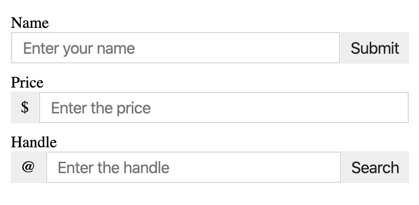
# Input Add-ons
Create add-on for input fields that can be put before or after an input field.
Preview (Zoomed In)
View Input Add-ons Solution
<!DOCTYPE html>
<html lang="en">
  <head>
    <meta charset="UTF-8" />
    <meta name="viewport" content="width=device-width, initial-scale=1.0" />
    <meta http-equiv="X-UA-Compatible" content="ie=edge" />
    <title>Input Add-ons Exercise Solution</title>
    <style>
      .layout {
        margin: 0 auto;
        max-width: 400px;
        padding: 20px;
      }

      .input-container {
        display: flex;
        margin-bottom: 10px;
      }

      .input-field,
      .input-addon {
        padding: 5px 10px;
        font-size: 16px;
      }

      .input-field {
        flex: 1;
      }

      .input-addon {
        background-color: #eee;
        border: none;
        line-height: 1.4;
      }
    </style>
  </head>
  <body>
    <div class="layout">
      <h1>Input Add-ons Exercise</h1>
      <!-- Append -->
      <label for="name">Name</label>
      <div class="input-container">
        <input
          type="text"
          id="name"
          class="input-field"
          placeholder="Enter your name"
        />
        <button class="input-addon">Submit</button>
      </div>

      <!-- Prepend -->
      <label for="price">Price</label>
      <div class="input-container">
        <div class="input-addon">$</div>
        <input
          type="text"
          id="price"
          class="input-field"
          placeholder="Enter the price"
        />
      </div>

      <!-- Both -->
      <label for="handle">Handle</label>
      <div class="input-container">
        <div class="input-addon">@</div>
        <input
          type="text"
          id="handle"
          class="input-field"
          placeholder="Enter the handle"
        />
        <button class="input-addon">Search</button>
      </div>
    </div>
  </body>
</html>
2
3
4
5
6
7
8
9
10
11
12
13
14
15
16
17
18
19
20
21
22
23
24
25
26
27
28
29
30
31
32
33
34
35
36
37
38
39
40
41
42
43
44
45
46
47
48
49
50
51
52
53
54
55
56
57
58
59
60
61
62
63
64
65
66
67
68
69
70
71
72
73
74
75
76
77
78
# Large
# Mondrian CSS Painting
Piet Mondrian is regarded as one of the greatest artists of the 20th century
He is known for being one of the pioneers of 20th-century abstract art, as he changed his artistic direction from figurative painting to an increasingly abstract style, until he reached a point where his artistic vocabulary was reduced to simple geometric elements.
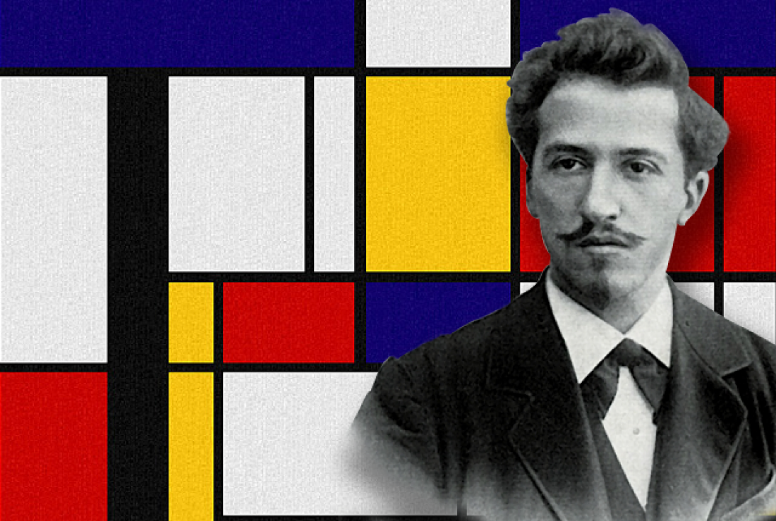
For this example, you are going to recreate his style of abstract painting using CSS And Flexbox. This exercise isn't about recreating the preview exactly, but creating something with similar style and direction. Feel free to get creative!
Preview
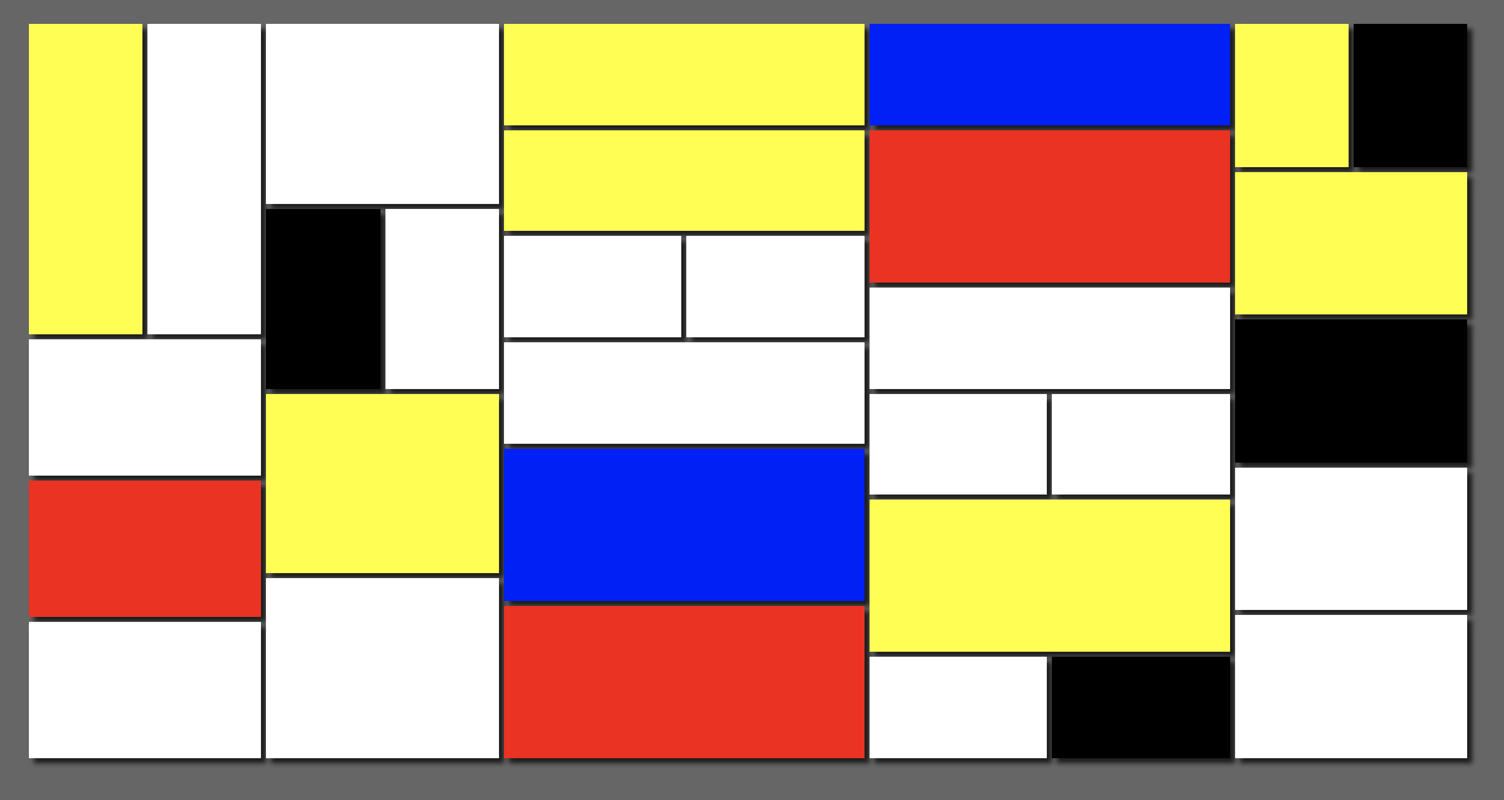
TIP
It will be easier to create reusable classes first (ex: yellow and row) and use the classes to create the painting.
View Mondrain Exercise Solution
<!DOCTYPE html>
<html lang="en">
  <head>
    <meta charset="UTF-8" />
    <meta name="viewport" content="width=device-width, initial-scale=1.0" />
    <meta http-equiv="X-UA-Compatible" content="ie=edge" />
    <title>Mondrain Exercise Solution</title>
    <style>
      * {
        box-sizing: border-box;
      }
      body {
        height: 100vh;
        background-color: #666;
        display: flex;
        padding: 100px;
      }
      .column {
        flex-direction: column;
      }
      .wrap {
        display: flex;
        justify-content: space-between;
        flex-grow: 1;
      }
      .shape {
        flex-grow: 1;
        background-color: #fff;
        min-width: 50px;
        min-height: 50px;
        margin-bottom: 5px;
        margin-right: 5px;
        box-shadow: 5px 5px 5px 0px rgba(0, 0, 0, 0.75);
      }
      .red {
        background-color: red;
      }
      .yellow {
        background-color: yellow;
      }
      .blue {
        background-color: blue;
      }
      .black {
        background-color: #000;
      }
      .double {
        flex-grow: 2;
      }
      .triple {
        flex-grow: 3;
      }
    </style>
  </head>
  <body>
    <div class="wrap">
      <div class="column wrap">
        <div class="wrap">
          <div class="yellow shape"></div>
          <div class="shape"></div>
        </div>
        <div class="wrap column">
          <div class="shape"></div>
          <div class="red shape"></div>
          <div class="shape"></div>
        </div>
      </div>
      <div class="column wrap">
        <div class="shape"></div>
        <div class="wrap">
          <div class="black shape"></div>
          <div class="shape"></div>
        </div>
        <div class="yellow shape"></div>
        <div class="shape"></div>
      </div>
      <div class="double column wrap">
        <div class="yellow shape"></div>
        <div class="yellow shape"></div>
        <div class="wrap">
          <div class="shape"></div>
          <div class="shape"></div>
        </div>
        <div class="shape"></div>
        <div class="double blue shape"></div>
        <div class="double red shape"></div>
      </div>
      <div class="double column wrap">
        <div class="column wrap">
          <div class="blue shape"></div>
          <div class="double red shape"></div>
          <div class="shape"></div>
          <div class="wrap">
            <div class="shape"></div>
            <div class="shape"></div>
          </div>
          <div class="double yellow shape"></div>
          <div class="wrap">
            <div class="shape"></div>
            <div class="black shape"></div>
          </div>
        </div>
      </div>
      <div class="column wrap">
        <div class="wrap">
          <div class="yellow shape"></div>
          <div class="black shape"></div>
        </div>
        <div class="yellow shape"></div>
        <div class="black shape"></div>
        <div class="shape"></div>
        <div class="shape"></div>
      </div>
    </div>
  </body>
</html>
2
3
4
5
6
7
8
9
10
11
12
13
14
15
16
17
18
19
20
21
22
23
24
25
26
27
28
29
30
31
32
33
34
35
36
37
38
39
40
41
42
43
44
45
46
47
48
49
50
51
52
53
54
55
56
57
58
59
60
61
62
63
64
65
66
67
68
69
70
71
72
73
74
75
76
77
78
79
80
81
82
83
84
85
86
87
88
89
90
91
92
93
94
95
96
97
98
99
100
101
102
103
104
105
106
107
108
109
110
111
112
113
114
115
116
# Interview Questions
# Fundamentals
- What is Flexbox and why would you use it?
- What are the advantages and disadvantages of using Flexbox over traditional positions and floats?
- How would you center something into the center of the screen using Flexbox?
# Architect
- Would you recommend a company using Flexbox for layout on production? Explain why.
- Do you recommend an existing project switch from traditional floats layout to Flexbox layout? What are the pros and cons to making that switch?
- What decisions do you make to decide to use Flexbox on a new project?