# Bootstrap
# Learning Objectives
After completing this lesson, you will be able to:
- Understand the advantages of using a front-end component library
- Know the benefits of reusability in design and development
- How to use Bootstrap documentation to build and create a web page
- How to use the Bootstrap grid system for creating complex grid systems
TIP
Bootstrap v4.4 is being used for this lesson.
# Lesson
# Overview
Bootstrap is the world's most popular front-end component library.
Bootstrap is an open source toolkit for developing with HTML, CSS, and JS. Quickly prototype your ideas or build your entire app with our Sass variables and mixins, responsive grid system, extensive prebuilt components, and powerful plugins built on jQuery.
# What is Prototyping?
Prototyping is a term used in web development for developing a website quickly using pre-defined code to create a working solution to test as a proof of concept for a business idea.
Typically a project does not start and end with a tool like Bootstrap. However, if the project does not require a unique or methodical design Bootstrap can give you 80%+ of the user interface (UI) elements you need.
# Installing Bootstrap
Installing Bootstrap is fairly simple using the BoostrapCDN.
The main thing to keep in mind is the CSS <link> for the styles and the <meta> tag for working with the responsive breakpoints.
View Starter Template
<!DOCTYPE html>
<html lang="en">
  <head>
    <!-- Required meta tags -->
    <meta charset="utf-8" />
    <meta
      name="viewport"
      content="width=device-width, initial-scale=1, shrink-to-fit=no"
    />

    <!-- Bootstrap CSS -->
    <link
      rel="stylesheet"
      href="https://stackpath.bootstrapcdn.com/bootstrap/4.4.1/css/bootstrap.min.css"
      integrity="sha384-Vkoo8x4CGsO3+Hhxv8T/Q5PaXtkKtu6ug5TOeNV6gBiFeWPGFN9MuhOf23Q9Ifjh"
      crossorigin="anonymous"
    />

    <title>Hello, world!</title>
  </head>
  <body>
    <h1>Hello, world!</h1>

    <!-- Optional JavaScript -->
    <!-- jQuery first, then Popper.js, then Bootstrap JS -->
    <script
      src="https://code.jquery.com/jquery-3.4.1.slim.min.js"
      integrity="sha384-J6qa4849blE2+poT4WnyKhv5vZF5SrPo0iEjwBvKU7imGFAV0wwj1yYfoRSJoZ+n"
      crossorigin="anonymous"
    ></script>
    <script
      src="https://cdn.jsdelivr.net/npm/popper.js@1.16.0/dist/umd/popper.min.js"
      integrity="sha384-Q6E9RHvbIyZFJoft+2mJbHaEWldlvI9IOYy5n3zV9zzTtmI3UksdQRVvoxMfooAo"
      crossorigin="anonymous"
    ></script>
    <script
      src="https://stackpath.bootstrapcdn.com/bootstrap/4.4.1/js/bootstrap.min.js"
      integrity="sha384-wfSDF2E50Y2D1uUdj0O3uMBJnjuUD4Ih7YwaYd1iqfktj0Uod8GCExl3Og8ifwB6"
      crossorigin="anonymous"
    ></script>
  </body>
</html>
2
3
4
5
6
7
8
9
10
11
12
13
14
15
16
17
18
19
20
21
22
23
24
25
26
27
28
29
30
31
32
33
34
35
36
37
38
39
40
41
42
Getting Started with Bootstrap
# Base Styling
Bootstrap will overwrite the default styles of all elements and create a more consistent and cohesive look and feel across all browsers. This includes the fonts and colors, as well as the default elements like inputs, tables, buttons, headings, etc...
TIP
There is a powerful way to theme Bootstrap however that will not be covered in this lesson. If you want to overwrite things like colors and fonts you will want to follow the theming documentation.
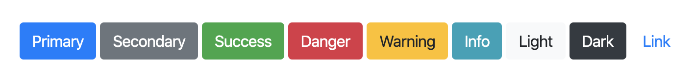
# Buttons
An example of a simple component built into Bootstrap is the button.
<button type="button" class="btn btn-primary">Primary</button>
<button type="button" class="btn btn-secondary">Secondary</button>
<button type="button" class="btn btn-success">Success</button>
<button type="button" class="btn btn-danger">Danger</button>
<button type="button" class="btn btn-warning">Warning</button>
<button type="button" class="btn btn-info">Info</button>
<button type="button" class="btn btn-light">Light</button>
<button type="button" class="btn btn-dark">Dark</button>
<button type="button" class="btn btn-link">Link</button>
2
3
4
5
6
7
8
9
The btn class is used to add all the default button styling from Bootstrap and the modifier classes use a - suffix and a semantic description word (examples: "primary", "danger", and "dark"). These semantic colors are used throughout the framework.
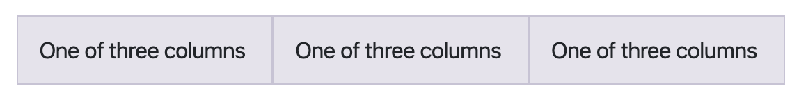
# Grid System
One of the most powerful tools in Bootstrap is the grid system. Here is the Bootstrap website's description:
Bootstrap’s grid system uses a series of containers, rows, and columns to layout and align content. It’s built with flexbox and is fully responsive.
Here is a quick sample of what the grid system looks like:
<div class="container">
  <div class="row">
    <div class="col-sm">
      One of three columns
    </div>
    <div class="col-sm">
      One of three columns
    </div>
    <div class="col-sm">
      One of three columns
    </div>
  </div>
</div>
2
3
4
5
6
7
8
9
10
11
12
13
The .container class is used for centering and adding horizontal padding. This is the outermost element for the grid system. Everything else go inside a container.
The grid system is then divided into a 12 column system separated by rows. The default column (mobile first) is .col- and accepts any number from 1 to 12. Every group of columns will add up to 12 total and wrapped inside a .row element.
<!-- 4 + 4 + 4 = 12 -->
<div class="row">
  <div class="col-4"></div>
  <div class="col-4"></div>
  <div class="col-4"></div>
</div>
2
3
4
5
6
If you don't include a number (ex: col) the flexbox attributes will automatically distribute the element from how many items are in the row.
<div class="row">
  <div class="col"></div>
  <div class="col"></div>
  <div class="col"></div>
</div>
2
3
4
5
If you want to change the layout depending on the device and viewport, you can add use the .col-sm-, .col-md-, .col-lg-, and .col-xl- classes.
<!-- 50% wide on extra small (mobile first) -->
<!-- and 33.3% wide on medium screens (desktop) -->
<div class="row">
  <div class="col-6 col-md-4"></div>
  <div class="col-6 col-md-4"></div>
  <div class="col-6 col-md-4"></div>
</div>
2
3
4
5
6
7
As you build out your site layout, you may have multiple containers and rows. All of the concepts shown about columns can be mixed and matched, as well as adjusting padding around rows and columns (called "gutters") and adjusting alignment using modifier classes. You can go in-depth with the Bootstrap grid system in the documentation
# Summary
Bootstrap offers a large collection of components you can mix and match to quickly create a fully responsive website. We went through buttons as well as the grid system for building complex and unique layouts.
# Training Exercises
To solidify your knowledge, here are a set of exercises that will require you to use the techniques you've just learned in the lesson above.
They are organized into small, medium, and large sized problems. The small exercises will be very similar to the examples in the lesson. If you get stuck, refer to the relevant section above. The medium exercises will require you to combine concepts. The lesson may not have a single, specific example for you to reference. The large exercises are more open-ended and may require you to search the web for additional material.
# Small
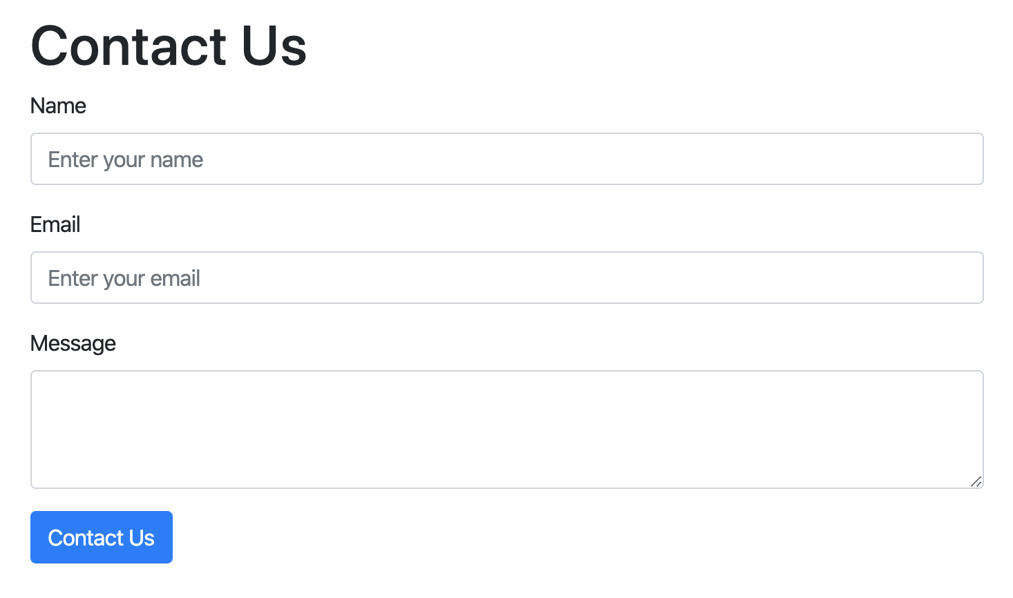
# Contact Form
Recreate the following form component using the forms components
Contact Form Solution
<!DOCTYPE html>
<html lang="en">
  <head>
    <meta charset="UTF-8" />
    <meta
      name="viewport"
      content="width=device-width, initial-scale=1, shrink-to-fit=no"
    />
    <title>Contact Form Solution</title>
    <link
      rel="stylesheet"
      href="https://stackpath.bootstrapcdn.com/bootstrap/4.4.1/css/bootstrap.min.css"
      integrity="sha384-Vkoo8x4CGsO3+Hhxv8T/Q5PaXtkKtu6ug5TOeNV6gBiFeWPGFN9MuhOf23Q9Ifjh"
      crossorigin="anonymous"
    />
  </head>

  <body>
    <div class="container pt-5 pb-5">
      <div class="row">
        <div class="col">
          <h1>Contact Us</h1>
          <form>
            <div class="form-group">
              <label for="name">Name</label>
              <input
                type="text"
                class="form-control"
                id="name"
                placeholder="Enter your name"
                aria-describedby="nameHelp"
              />
            </div>

            <div class="form-group">
              <label for="email">Email</label>
              <input
                type="email"
                class="form-control"
                id="email"
                placeholder="Enter your email"
                aria-describedby="emailHelp"
              />
            </div>

            <div class="form-group">
              <label for="message">Message</label>
              <textarea class="form-control" id="message" rows="3"></textarea>
            </div>

            <button type="submit" class="btn btn-primary">Contact Us</button>
          </form>
        </div>
      </div>
    </div>

    <script
      src="https://code.jquery.com/jquery-3.4.1.slim.min.js"
      integrity="sha384-J6qa4849blE2+poT4WnyKhv5vZF5SrPo0iEjwBvKU7imGFAV0wwj1yYfoRSJoZ+n"
      crossorigin="anonymous"
    ></script>
    <script
      src="https://cdn.jsdelivr.net/npm/popper.js@1.16.0/dist/umd/popper.min.js"
      integrity="sha384-Q6E9RHvbIyZFJoft+2mJbHaEWldlvI9IOYy5n3zV9zzTtmI3UksdQRVvoxMfooAo"
      crossorigin="anonymous"
    ></script>
    <script
      src="https://stackpath.bootstrapcdn.com/bootstrap/4.4.1/js/bootstrap.min.js"
      integrity="sha384-wfSDF2E50Y2D1uUdj0O3uMBJnjuUD4Ih7YwaYd1iqfktj0Uod8GCExl3Og8ifwB6"
      crossorigin="anonymous"
    ></script>
  </body>
</html>
2
3
4
5
6
7
8
9
10
11
12
13
14
15
16
17
18
19
20
21
22
23
24
25
26
27
28
29
30
31
32
33
34
35
36
37
38
39
40
41
42
43
44
45
46
47
48
49
50
51
52
53
54
55
56
57
58
59
60
61
62
63
64
65
66
67
68
69
70
71
72
73
# Medium
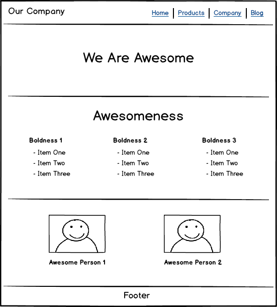
# Basic Layout
Use Bootstrap to make the layout pictured below.
View Basic Layout Solution
<!DOCTYPE html>
<html lang="en">
  <head>
    <meta charset="UTF-8" />
    <meta
      name="viewport"
      content="width=device-width, initial-scale=1, shrink-to-fit=no"
    />
    <title>Bootstrap Layout Solution</title>
    <link
      rel="stylesheet"
      href="https://stackpath.bootstrapcdn.com/bootstrap/4.4.1/css/bootstrap.min.css"
      integrity="sha384-Vkoo8x4CGsO3+Hhxv8T/Q5PaXtkKtu6ug5TOeNV6gBiFeWPGFN9MuhOf23Q9Ifjh"
      crossorigin="anonymous"
    />
  </head>
  <body>
    <div class="container-fluid">
      <header class="row align-items-center">
        <div class="col">
          <h1 class="mb-0">Our Company</h1>
        </div>
        <div class="col-md-auto">
          <ul class="nav">
            <li class="nav-item">
              <a class="nav-link active" href="#">Home</a>
            </li>
            <li class="nav-item">
              <a class="nav-link" href="#">Products</a>
            </li>
            <li class="nav-item">
              <a class="nav-link" href="#">Company</a>
            </li>
            <li class="nav-item">
              <a class="nav-link" href="#">Blog</a>
            </li>
          </ul>
        </div>
      </header>
    </div>

    <hr />

    <section class="container">
      <div class="row">
        <div class="col text-center mt-5 mb-5">
          <h1 class="display-1">We are Awesome</h1>
        </div>
      </div>
    </section>

    <hr />

    <section class="container">
      <div class="row">
        <div class="col text-center">
          <h2 class="display-3">Awesomeness</h2>
        </div>
      </div>
      <div class="row justify-content-around">
        <div class="col-auto">
          <h3>Boldness 1</h3>
          <ul>
            <li>Item One</li>
            <li>Item Two</li>
            <li>Item Three</li>
          </ul>
        </div>
        <div class="col-auto">
          <h3>Boldness 2</h3>
          <ul>
            <li>Item One</li>
            <li>Item Two</li>
            <li>Item Three</li>
          </ul>
        </div>
        <div class="col-auto">
          <h3>Boldness 3</h3>
          <ul>
            <li>Item One</li>
            <li>Item Two</li>
            <li>Item Three</li>
          </ul>
        </div>
      </div>
    </section>

    <hr />

    <div class="container mt-5 mb-5">
      <div class="row justify-content-around">
        <div class="col-auto">
          <div class="card">
            <img
              src="https://picsum.photos/300/200"
              class="card-img-top"
              alt="random image"
            />
            <div class="card-body">
              <p class="card-text">Awesome photo 1</p>
            </div>
          </div>
        </div>
        <div class="col-auto">
          <div class="card">
            <img
              src="https://picsum.photos/300/200"
              class="card-img-top"
              alt="random image"
            />
            <div class="card-body">
              <p class="card-text">Awesome photo 2</p>
            </div>
          </div>
        </div>
      </div>
    </div>

    <hr />

    <footer class="container text-center pb-3">
      <div class="row">
        <div class="col">Footer</div>
      </div>
    </footer>

    <script
      src="https://code.jquery.com/jquery-3.4.1.slim.min.js"
      integrity="sha384-J6qa4849blE2+poT4WnyKhv5vZF5SrPo0iEjwBvKU7imGFAV0wwj1yYfoRSJoZ+n"
      crossorigin="anonymous"
    ></script>
    <script
      src="https://cdn.jsdelivr.net/npm/popper.js@1.16.0/dist/umd/popper.min.js"
      integrity="sha384-Q6E9RHvbIyZFJoft+2mJbHaEWldlvI9IOYy5n3zV9zzTtmI3UksdQRVvoxMfooAo"
      crossorigin="anonymous"
    ></script>
    <script
      src="https://stackpath.bootstrapcdn.com/bootstrap/4.4.1/js/bootstrap.min.js"
      integrity="sha384-wfSDF2E50Y2D1uUdj0O3uMBJnjuUD4Ih7YwaYd1iqfktj0Uod8GCExl3Og8ifwB6"
      crossorigin="anonymous"
    ></script>
  </body>
</html>
2
3
4
5
6
7
8
9
10
11
12
13
14
15
16
17
18
19
20
21
22
23
24
25
26
27
28
29
30
31
32
33
34
35
36
37
38
39
40
41
42
43
44
45
46
47
48
49
50
51
52
53
54
55
56
57
58
59
60
61
62
63
64
65
66
67
68
69
70
71
72
73
74
75
76
77
78
79
80
81
82
83
84
85
86
87
88
89
90
91
92
93
94
95
96
97
98
99
100
101
102
103
104
105
106
107
108
109
110
111
112
113
114
115
116
117
118
119
120
121
122
123
124
125
126
127
128
129
130
131
132
133
134
135
136
137
138
139
140
141
142
143
# Large
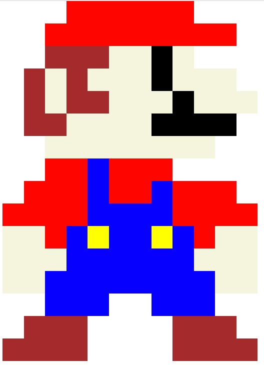
# Pixel Art
Recreate the following pixel art image using the Bootstrap grid system.
# Interview Questions
# Fundamentals
- What is the current major release version of Bootstrap?
- How would you describe a project like Bootstrap to a non-technical person?
- Which license does Bootstrap use? Explain what that means and how a business owner can use it for their product.
# Bugfix
- If you found a major bug in an existing project using Bootstrap, what steps would you take to fix it?
- When do you think it's a good idea to upgrade Bootstrap in an existing project?
# Conceptual
- What are the advantages of using Bootstrap?
- What are the disadvantages of using Bootstrap?
# Architect
- How do you decide to use a framework like Bootstrap for a company project?
- How would you organize your components using Bootstrap and building custom UI components in the same project?
- Do you recommend upgrading a project from Bootstrap 3 to Bootstrap 4? Explain why.
- Do you think it's better to use the BootstrapCDN or download the files through NPM? Explain why.
Ask them how they would build a particular feature or set of features.