# CSS Animations
# Learning Objectives
After completing this lesson, you will be able to:
- Animate HTML elements with CSS
- Understand the basics of good animation
- Create animation keyframes
- Assign keyframes and animation properties to elements
- Write animations with shorthand
# Lesson
# Overview
Animation can improve the user's experience of a website by providing visual feedback. CSS offers powerful animation tools for transitioning between styles.
# What's Good Animation?
Before going into the technical details, what makes an animation good? Here is a basic rule of thumb: keep it simple, quick, and have a purpose. When an animation is over-the-top, takes too long, or is meaningless it comes across as poor design and can hinder the user's experience. This lesson will provide more tips along the way for how to create good animations for the web.
# Keyframes
The @keyframes rule is a named definition of what style you want to go to and from.
@keyframes box-color-change {
  from {
    background-color: blue;
  }
  to {
    background-color: green;
  }
}
2
3
4
5
6
7
8
You then use the animation with the animation-name property. The animation-duration is also require to tell the system how long the animation will last.
.box {
  animation-name: box-color-change;
  animation-duration: 1s;
}
2
3
4
Hover over the blue box to see the animation:
# Animation Properties
There are many properties you can use to further customize animations.
# Delay
The animation-delay property will set a delay on when the animation starts.
animation-delay: 1s;
# Iterations
An animation sequence will only happen once by default. The animation-iteration-count property value can be a number, for how many times you want the animation to run, or infinite if you want it to continue forever.
# Direction
The direction of the animation can be controlled with the animation-direction property. Its values can be normal (default) to play forward, reverse to play backwards, or alternate will cycle between normal and reverse every iteration (alternate-reverse to start in the reverse direction).
normalreversealternatealternate-reverse# Timing
Animation timing is an important attribute for adjusting the speed curve of the animation.
lineareaseease-inease-outease-in-outPicking the right timing
When deciding on animation timing, keep in mind the direction of the animation. ease-in at 300ms is great for a quick fade-in. linear can be used when you want an timing to be consistent.
# Fill-Mode
The animation-fill-mode property can change the behavior for when the animation is not running.
none- Does not set any styles before or after the animation runs. (The default value)forwards- Retains the styles set by the last keyframe of the animation.backwards- Retains the styles set by the first keyframe of the animation.both- works likeforwardandbackwarddepending on the direction of the animation.
# Shorthand
There is a shorthand property, animation, that allows you to define multiple animation values on one property. Here are all of the animation properties in the order the shorthand property accepts them and an example of how it can be done using the single animation property.
.ball {
  animation-name: bounce;
  animation-duration: 2s;
  animation-timing-function: ease-in-out;
  animation-delay: 1s;
  animation-iteration-count: infinite;
  animation-direction: alternate;
}

.ball {
  animation: bounce 2s ease-in-out 1s infinite alternate;
}
2
3
4
5
6
7
8
9
10
11
12
The animation property doesn't require all of these values, if you only need the first few values you can call it like this:
.ball {
  animation: bounce 2s ease-in-out;
}
2
3
# Summary
CSS animation is offered with a powerful set of CSS properties that allows you to animate elements. You learned how to define keyframes and apply them to elements. You also learned about animation properties for setting a delay, iteration, direction and timing and the animation property that allows you to use shorthand to reduce how much code is needed.
Animation is a simple an powerful way to improve the user's experience and visual style of your web projects.
# Training Exercises
To solidify your knowledge, here are a set of exercises that will require you to use the techniques you've just learned in the lesson above.
They are organized into small, medium, and large sized problems. The small exercises will be very similar to the examples in the lesson. If you get stuck, refer to the relevant section above. The medium exercises will require you to combine concepts. The lesson may not have a single, specific example for you to reference. The large exercises are more open-ended and may require you to search the web for additional material.
# Small
# Move image from left to right
Animate an image starting from the left and move it to the right 200px.
Move image from left to right solution
<!DOCTYPE html>
<html lang="en">
  <head>
    <meta charset="UTF-8" />
    <meta name="viewport" content="width=device-width, initial-scale=1.0" />
    <title>Move Image From Left To Right Solution</title>
    <style>
      .image {
        position: relative;
        animation-name: left-to-right;
        animation-duration: 3s;
        animation-delay: 2s;
      }

      @keyframes left-to-right {
        from {
          left: 0;
        }

        to {
          left: 200px;
        }
      }
    </style>
  </head>
  <body>
    <img src="https://picsum.photos/300/200" alt="placeholder" class="image" />
  </body>
</html>
2
3
4
5
6
7
8
9
10
11
12
13
14
15
16
17
18
19
20
21
22
23
24
25
26
27
28
29
# Bouncing Ball
Create a bouncing ball using CSS. You can use position: relative and move the ball relatively with keyframes. Here are some details:
- Create a ball using CSS (see code below)
- Make the ball bounce up-and-down 5 times
- Use the
ease-outtiming
width: 100px;
height: 100px;
background-color: red;
border-radius: 50%;
2
3
4
Bouncing Ball Solution
<!DOCTYPE html>
<html lang="en">
  <head>
    <meta charset="UTF-8" />
    <meta name="viewport" content="width=device-width, initial-scale=1.0" />
    <title>Bouncing Ball Solution</title>
    <style>
      .container {
        margin: 0 auto;
        max-width: 100px;
        text-align: center;
      }

      @keyframes bounce {
        to {
          top: 0;
        }
        from {
          top: 100px;
        }
      }

      .ball {
        width: 100px;
        height: 100px;
        position: relative;
        background-color: red;
        border-radius: 50%;
        animation: bounce 1s ease-out 0s 10 alternate-reverse;
      }
    </style>
  </head>
  <body>
    <div class="container">
      <div class="ball"></div>
    </div>
  </body>
</html>
2
3
4
5
6
7
8
9
10
11
12
13
14
15
16
17
18
19
20
21
22
23
24
25
26
27
28
29
30
31
32
33
34
35
36
37
38
# Heartbeat
Create a heart that beats. This can be achieved with the ♥ special character ♥. Here are some details to help you get started:
- To display the heart place
<span class="heart">♥</span>in your HTML - Add
transform-origin: center;to the.heartelement - Alternate to
transform: scale(1.5)indefinitely by defining keyframes and applying the animation with the necessary properties - Horizontally center the heart
Heartbeat Solution
<!DOCTYPE html>
<html lang="en">
<head>
<meta charset="UTF-8" />
<meta name="viewport" content="width=device-width, initial-scale=1.0" />
<title>Heartbeat Exercise Solution</title>
<style>
body {
margin-top: 100px;
text-align: center;
width: 500px auto;
}
@keyframes heartbeat {
to {
transform: scale(1.5);
}
}
.heart {
animation: heartbeat 300ms infinite alternate;
font-size: 100px;
color: red;
transform-origin: center;
}
.container {
margin: 0 auto;
max-width: 100px;
}
</style>
</head>
<body>
<div class="container">
<div class="heart">♥</div>
</div>
</body>
</html>
2
3
4
5
6
7
8
9
10
11
12
13
14
15
16
17
18
19
20
21
22
23
24
25
26
27
28
29
30
31
32
33
34
35
36
37
38
# Medium
# Loading Indicator
Create a simple loading indicator, there will be 5 dots moving up and down with each dot being delayed 200ms from the next. This creates a ripple effect.
# Large
# Page Fade-In Animation
Create a simple layout of an image and text like show below:
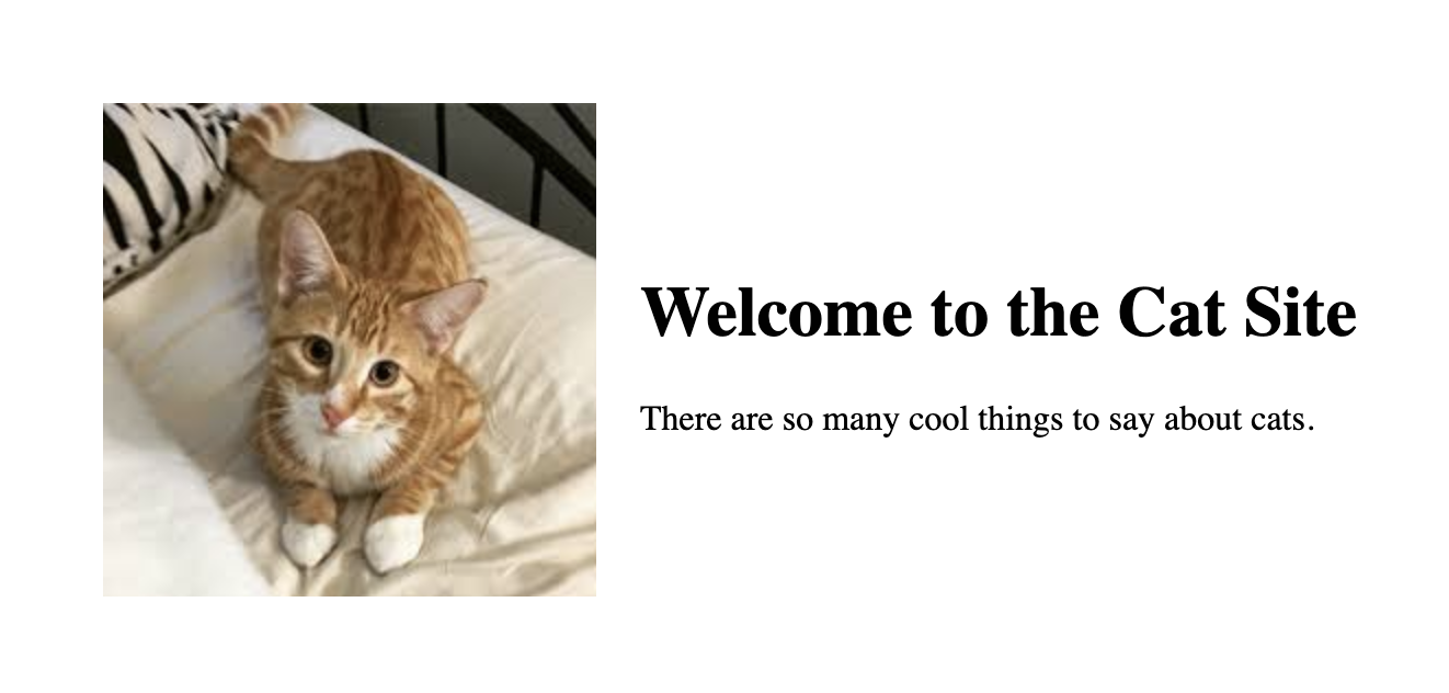
Add the following animation to the elements above:
- Fade in the image and text by setting the opacity and position
- Add a delay to the text so it animates after the image
- Set the animation timing to
forwardso the items stay visible after the animation
View the solution to see the final result.
Page Fade-In Animation Solution
<!DOCTYPE html>
<html lang="en">
  <head>
    <meta charset="UTF-8" />
    <meta name="viewport" content="width=device-width, initial-scale=1.0" />
    <title>Page Layout Animation Solution</title>
    <style>
      .container {
        margin: 0 auto;
        padding-top: 100px;
        max-width: 700px;
        display: flex;
        align-items: center;
      }

      @keyframes fade-in-item {
        from {
          opacity: 0;
          right: 20px;
        }
        to {
          opacity: 1;
          right: 0;
        }
      }

      .container__image {
        opacity: 0;
        position: relative;
        margin-right: 20px;
        animation: fade-in-item 1s forwards;
      }

      .container__text {
        opacity: 0;
        position: relative;
        animation: fade-in-item 1s forwards 500ms;
      }
    </style>
  </head>
  <body>
    <div class="container">
      <img src="./cat-photo.jpeg" alt="Cat" class="container__image" />
      <div class="container__text">
        <h1>Welcome to the Cat Site</h1>
        <p>There are so many cool things to say about cats.</p>
      </div>
    </div>
  </body>
</html>
2
3
4
5
6
7
8
9
10
11
12
13
14
15
16
17
18
19
20
21
22
23
24
25
26
27
28
29
30
31
32
33
34
35
36
37
38
39
40
41
42
43
44
45
46
47
48
49
50
# Interview Questions
# Fundamentals
- When is it a good idea to add animations?
- How do you create an animation in CSS?
# Bugfix
Show them code and ask them what they would change to make it exhibit the correct behavior.
# Conceptual
Ask them how a technique or technology works.
- Why not create animations using JavaScript?
# Architect
Ask them how they would build a particular feature or set of features.
- Animating an image carousel that shows one image at a time, sliding images into view from the left and sliding the images out of view to the right.